Over the past 10-years we’ve worked on a broad range of healthcare projects, from prototyping, launching and maintaining innovative new digital services to optimising the information architecture of health board websites that run on legacy technology. Across all of these projects we’ve always strived to achieve our company’s vision and mission, whilst adhering to our values and approach to design.
As external user experience consultants, there’s no doubt we’ve found the NHS design principles and digital service manual to be invaluable resources that we’ve turned to time and time again across a range of national and regional NHS projects we’ve worked on.
What is the NHS digital service manual?
The NHS digital service manual is an incredible resource that empowers internal and external teams to design and build better services for the NHS.
Maintained by a dedicated team the NHS digital service manual can be used to:
- Build consistent, usable services that put people first.
- Learn from the research and experience of other NHS teams.
It includes a/an:
- Overview of best practice in terms of standards and technology.
- The NHS design system.
- Content style guide.
- Accessibility guidance.
- Design principles.
- Information on how to join the community and contribute to the service manual.
It truly is a comprehensive resource that is constantly being updated.
What are the NHS design principles?
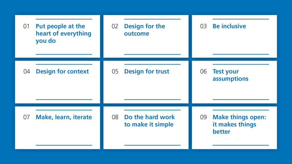
Inspired by the Government Digital Service’s design principles and the NHS Constitution, NHS Digital (now part of NHS England) launched their Design Principles in 2018. The purpose of these principles is to:
“Guide designers’ decision making, and help people from other professions understand what design is for, and how it can benefit people.
Designers working in the NHS come from a variety of backgrounds and we want to ensure they understand the unique challenges presented by designing for health and care. A clear and memorable set of design principles will help them understand what is expected of them.
Our principles focus on either people or process. People, so that we are always reminded of who we are designing for (people using NHS services, carers, healthcare professionals, etc). Process, so everyone is working and making services in a similar way.”
Design principles for health and care – (NHS Digital, 2nd October 2018)
Putting NHS design principles into practice
We have our own approach to design that is underpinned by our own in-house design principles. Yet, we refer to NHS Design principles at the outset, and throughout, each and every health and care project we’ve worked on – whether they’ve been NHS-related or not.
Why? Because, these principles truly reflect the unique challenges presented by designing for health and care. They remind us of the importance of designing with compassion, and reiterate that NHS services are for everyone, and therefore any touch point should be too. Which is why, 5-years on, we still find them as relevant and useful as ever.
We’re committed to advocating for, and adhering to, NHS design principles
Some see principles as an impediment. We see them as an enabler that helps us do our best work. Our past and current work evidences our commitment to advocating for, and adhering to, NHS Design principles, for example:
1. Put people at the heart of everything you do
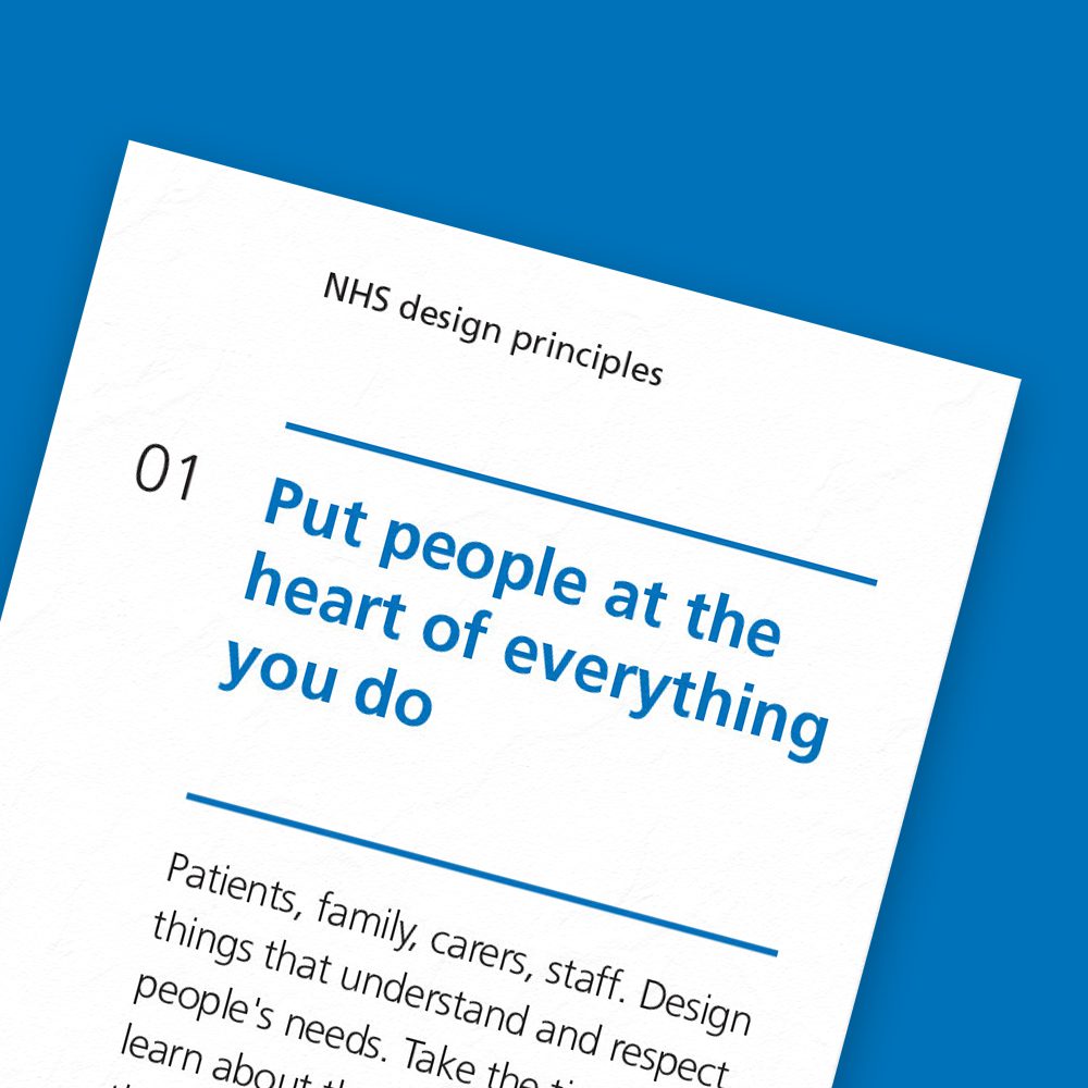
“Patients, family, carers, staff. Design things that understand and respect people’s needs. Take the time to learn about the whole person – their emotional, physical and technical needs. Design with compassion.”
We strive to make positive change and are always conscious of the impact of our work. As a user experience consultancy, we adopt a user centred approach to design by default.
That is why we conduct primary and/or secondary research on each and every project we take on. As doing this informs our understanding of people’s differing needs, pain points, and desired outcomes. Investigating key questions and testing our assumptions ensures all key design decisions are underpinned by a thorough understanding of who we are designing for and what matters to them.
We often translate these findings into proto-personas to establish a shared understanding of “who” we are designing for and “what” key contextual information must be responded to, e.g. triggers, scenarios, intent, needs, context of use, etc. These are tailored to the specific project to ensure they deliver the maximum value. For example, sometimes the primary audience for these are:
- Client-side decision-makers who need to make informed decisions, e.g. what is the purpose of this touch point, how should we measure success, etc.
- Client-side content authors or administrators who are responsible for designing, publishing and governing content that meets the needs of a broad range of citizens.
- External development companies who are responsible for creating accessible and functional digital touch points.
- Our internal team who use them to guide decisions and evaluate outputs throughout the course of a design process.
Irrespective of the audience, we always ensure these deliverables effectively communicate needs, top tasks, and most importantly key contextually relevant information that help us understand how various people are likely to begin and end their time with what we’re designing.
2. Design for the outcome
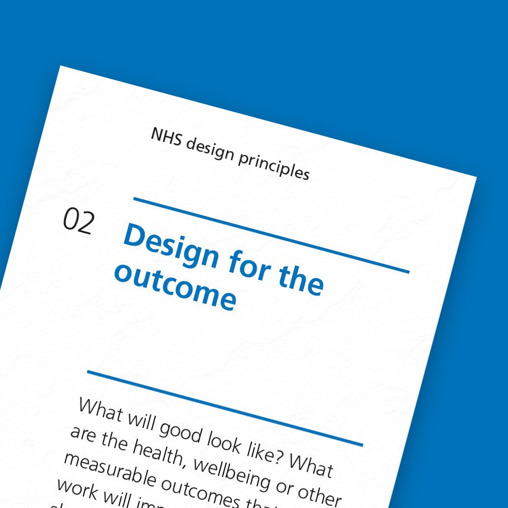
“What will good look like? What are the health, wellbeing or other measurable outcomes that your work will impact?”
We focus on solving the right problems, so we can achieve more with less. To achieve this we need to know how we’re going to measure success.
That’s why we’re committed to defining SMART (specific, measurable, achievable, relevant, time-locked) goals or objectives and measurements of success frameworks at the outset of a project. As doing this enables us to:
- Focus on the change we must affect.
- Understand how we can align and, if possible, contribute to broader long-term outcomes.
When doing this it’s critical to go beyond vanity metrics and truly focus on the measurements of success that matter. These are rarely easy-to-measure, and often involve cross-channel interactions. But that doesn’t mean we shouldn’t try to measure them or obfuscate that these are the things we are really trying to influence.
3. Be inclusive
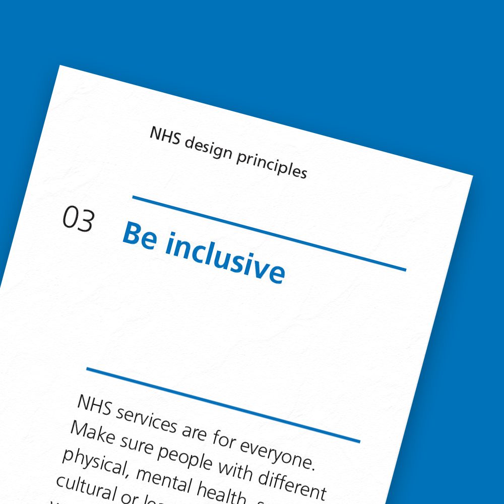
“NHS services are for everyone. Make sure people with different physical, mental health, social, cultural or learning needs can use your design.”
This is an area we can, and are always willing to, learn more about.
At the outset of a project we always discuss inclusivity and accessibility requirements. As these need to be considered at the outset of a project and influence all key technical, design and content decisions.
Yes, “1 in 5 people have a disability – this could be visual, hearing, motor (affecting fine movement) or cognitive (affecting memory and thinking).” But it’s also critical to remember this concept should apply to everyone – after all, we all have differing needs at different times and in different circumstances. Variables like location, health, equipment, connectivity, etc, all matter. Ultimately, accessibility is about making sure a service or touch point can be used by as many people as possible.
On the healthcare projects we’ve worked on we’ve always tried to:
- Maintain an open-mind and continuously challenge our assumptions.
- Identify and embrace universal needs that must be met.
- Ensure the archetypal proto-personas we create are representative of a broad range of accessibility requirements.
- Advocate for progressive enhancement.
- Design solutions that meet the specific needs of local populations and geographies, for example the default radius of a map that displays local hospitals should differ depending on the health board.
- Prioritise accessibility over aesthetics throughout the design process.
- Ensure all outputs are tested, meet and where possible exceed requirements
4. Design for context

“Don’t just design your part of a service. Consider people’s entire experience, and the infrastructure and processes involved. Think about how people begin and end their time with what you are designing.”
People tend to use healthcare websites with a particular intent in mind. But, even when people share a similar intent, they’re likely to think, feel and do things differently. That’s why it’s critical to:
- Learn how different environments, circumstances, and events, can influence people’s needs, even when they share a similar intent.
- Think about things from the broadest possible perspective. Focus on journeys, not just screens or transactional processes.
- Think about things in stages, before, during and after … as this will help you identify all of the different organisations, touch points and interactions that are likely to play a role in your users’ journey’s.
As the more you understand about the context you’re designing for, the greater your chances of delivering a successful solution.
5. Design for trust
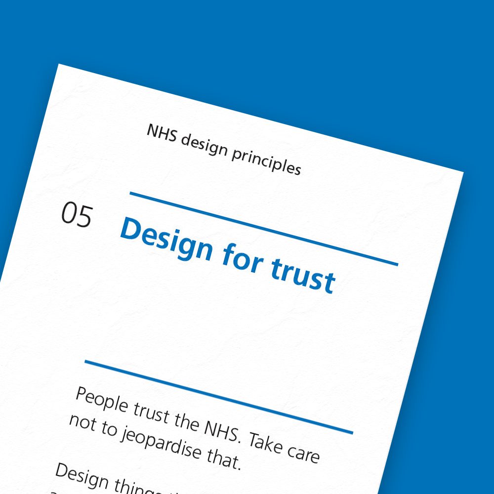
“People trust the NHS. Take care not to jeopardise that. Design things that are reliable and secure.”
It’s hard to tell who you can trust these days. Always remember to earn and maintain people’s trust.
This isn’t just about sticking a logo on something. It’s about sweating the little details … and ensuring you design a secure, reliable and consistent experience that reaffirms why people trust the NHS.
6. Test your assumptions
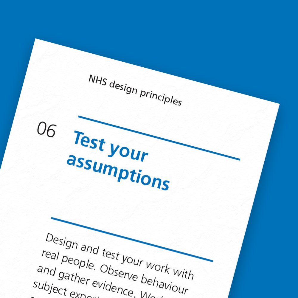
“Design and test your work with real people. Observe behaviour and gather evidence. Work with subject experts and existing research. Do not rely on hunches.”
One of our company values is to “continuously challenge our assumptions to deliver the outcomes that matter most.” We do this by:
- Asking ourselves what should be considered a fact and what should be considered an assumption.
- For each assumption we’ll then try and identify:
- Confidence levels.
- Likely (scale/severity) of impact.
- As and when we generate ideas or solutions, we frame these as hypotheses to be tested.
Doing this informs our research and testing priorities.
Once solutions go-live, we always ensure feedback loops are put in place. As this enables us, or internal teams, to continuously improve outputs based on ongoing qualitative and quantitative feedback.
7. Make, learn, iterate

“Start small. Experiment with different ways of doing things. Make prototypes to improve your understanding. Test and refine.”
Yet again, we share this principle. As irrespective of the deliverable we’re working on, we acknowledge that our initial outputs can always be improved. This is the explanatory text we use to share our in-house take on the statement “make, learn, iterate”:
“Don’t cut corners, don’t assume, don’t do big reveals … make it easy to experiment, capture and respond to feedback. Start small. Experiment with different ways of doing things. Then test and refine these as early as possible, both internally and externally.”
On past NHS projects we’ve adopted a truly collaborative approach and involved internal and external stakeholders as much as we can throughout design and development processes. As we genuinely believe the more feedback we capture on works-in-progress the better the end output will be.
8. Do the hard work to make it simple
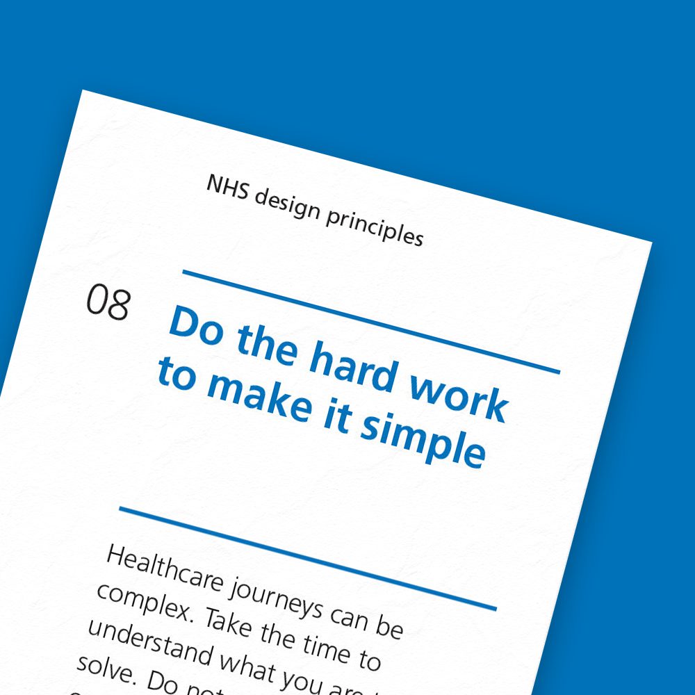
“Healthcare journeys can be complex. Take the time to understand what you are trying to solve. Do not push complexity onto the people using what you are designing.”
As a user experience consultancy this principle really resonates with us. In fact, this is why we do what we do.
For us, this can manifest itself in many ways … whether it being the first person to take a stab at documenting something through to translating technical jargon into plain-English. The important thing is this principle reminds us that at each and every turn it’s our job to simplify things for others. This doesn’t just apply to the people who will use what we design, it applies to all stakeholders involved in the process of making it a reality … this includes:
- Senior leadership teams.
- Management and governance teams.
- Clinical and non-clinical staff.
- Content design and governance teams.
- Development teams.
People rarely see how much thinking, and testing, goes into the final outputs we deliver. But as a user experience consultancy that’s exactly what we’re paid to do, and we love it.
9. Make things open. It makes things better
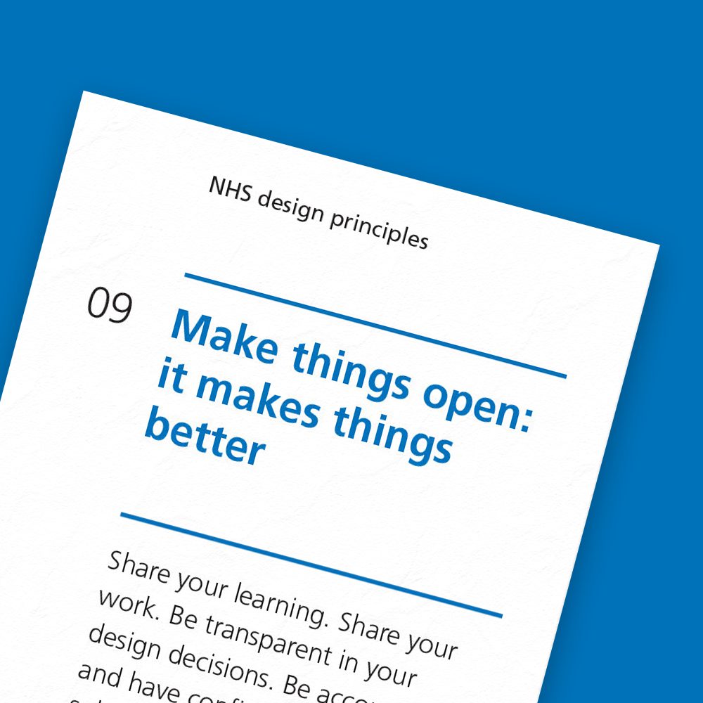
“Share your learning. Share your work. Be transparent in your design decisions. Be accountable and have confidence in your solutions.”
This is something we wholeheartedly believe in. As we genuinely believe what we do, and learn on a project, could have value to others’.
This doesn’t just apply to the finalised and polished outputs, it’s about the process too. That’s why when appropriate we’ll always recommend adopting an “open” design process. But if that’s not possible we’ll always try and identify assets or insights we can share once a project is complete.
We are currently in the process of seeking clearance to release proto-personas we’ve developed in the past, and hope to be able to share these over the coming months. As by sharing them with a broader audience:
- We can contribute to highlighting the diverse scenarios, needs and desired outcomes of archetypal characters that engage with public sector organisations and the services they deliver.
- Others may be able to benefit from the content, structure and/or the process of developing and refining them.
- There’s an opportunity for them to be updated and improved based on further feedback.
If these resources and tools can help one person save time they can invest on other added-value tasks, then the value of sharing key learning points and resources is clear.
Closing thoughts
In a time when the NHS continues to face extreme pressures, it’s imperative that new touch points and digital services address operational challenges, and most importantly help people achieve better health and care outcomes.
As an external and independent consultancy that has worked across national and regional NHS organisations, the NHS Design principles have proved invaluable to us. They don’t tell you how to do things, that’s not the point of them. But they definitely help you make or advocate for certain decisions as and when you run problems, irrespective of the application or topic.
As user centred design practitioners there’s a natural fit between our design principles and those of the NHS. And, ever since they were launched in 2018 the NHS design principles, and the broader digital service manual, have certainly proved to be an incredibly useful reference point and accelerator on the design and build projects we’ve worked on.
So, if you haven’t already you should certainly explore the NHS digital service manual. And, if you’re working on a design and build project for the NHS over the coming months, we’d urge you to dive into the Design system and Prototype kit, they truly are incredible resources! They won’t just save you time, they’ll empower you to deliver better outputs and outcomes.
