In a multicultural and multilingual world, it is important to consider cultural norms and translatability when creating content for your website or launching in a new country. That’s why every product, campaign, and service should have local users in mind to be successfully adapted to different countries and languages.
The User Experience in International markets
Whether you are looking to launch your website in a new country or are seeking to make your site more accessible to foreign-language speakers in your existing market, creating a seamless UX experience is the key to attracting new segments.
Proper translation and localisation of your website can ensure that the right keywords are chosen and make your website easier to find on localised search engines.
Beyond the simple auto-translate options provided by most browsers such as Chrome, localisation can boost conversion, revenue and customer satisfaction while also reducing the number of cases that escalate to customer support lines.
For the ideal User Experience, a user should not be able to detect that the product or service they are using stems from a different country and cultural background.
The Cross-Cultural User Experience
Just as we can create hundreds of personas within one culture, we can also create endless variations of personas across cultures. Website layout and user habits can vary significantly across countries and regions. To optimise cross-cultural growth, it is best to begin your UX research within a distinct region or country and slowly expand the research and understanding from there.
A website built for British users may have a simple design, minimal text, and a direct call to action, whereas a Chinese version of the same website could feature a variety of calls to action and features to engage the consumer. This is well demonstrated in the differences between the home pages of KFC UK and KFC China:
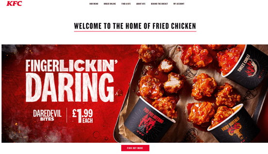
vs.
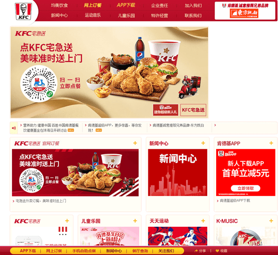
Cultural differences can also correlate to more subtle considerations. As Dutch culture is more direct and pragmatic, an e-commerce site in the Netherlands might aim to guide the user through a purchase as quickly as possible. Meanwhile, German users tend to be more detail-oriented, and the same e-commerce site’s German version might aim to provide the user with as much detail as possible to help them make an informed and trusted decision.
The nuances between cultures at both micro and macro levels are vast. Therefore, local user research and testing are key when determining how to improve the user experience. While a translator may focus on the language and copy of the website, a full localisation can deem whether the copy is appropriate and useable. This research can also help determine the platforms which are most commonly used in that culture (mobile or desktop), as well as the bandwidth needs and requirements of the country (3G vs 5G availability).
Localisation at inception
Most commonly, localisation is considered when a new country launch is scheduled and the website is then adapted to the new country. Adapting a website that wasn’t designed with international markets in mind may lead to having to choose between brand consistency and the user experience.
These can lead to the introduction of new language and elements that are not native to the original site design. In turn, this often results in a suboptimal UX experience for the new market and can lead to the translations not fitting into a rigid UX design (leading to broken designs, out of context translations and overflowing text on buttons).
As with general UX design, auditing, and review processes, it’s important to test, improve and optimise throughout the design process to ensure that any changes being made can fit clearly within existing brand guidelines and cultural norms.
For each target culture, you must understand if the product matches the local user’s mental model of how it should work. Collaborating with local UX researchers and designers is key to ensuring that your overall website is not only well translated but that it is relatable to the user. Are the images, icons, and labels appropriate and understandable? Is the website format, messaging, and call to action clear and effective? Local UX researchers can help guide you through these common questions.
Don’t forget the smaller details
As important as design and language are to your localisation efforts, it is key to remember that elements such as people’s names, addresses, units of measurement, dates, times, and currencies must also be adapted to the local market.
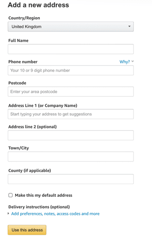
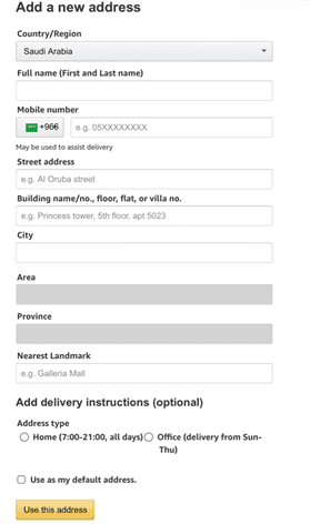
A great example of this is the design of the address form. While in the UK, the address form is usually designed to focus on the postcode, in the US the form would focus first on the state. Similarly, while a UK form may only need one line for the address, an address in Turkey may need three or four lines to fit long street names and descriptors.
Ideally, this would be addressed by a country-specific website containing the necessary form for that country or by creating different options by first selecting the country of address.
Sometimes, the solution for localisation is through simplification. This can best be demonstrated in the way we create forms that ask for names and titles. Separating the Title, First Name, and Last Name into three separate boxes is a common way of creating a form in many countries. However, the easiest solution to creating a form that works across borders is to have one box with a Full Name; which the user can then fill in based on their country’s norm and choose to include titles if relevant.
The address forms for the UK and Saudi Arabia Amazon sites demonstrate these details well. While the language does not change, the site demonstrates the variety, versatility, and localisation needed in the address fields:
When localisation is not an option, optimise for translation
If you are seeking to offer new languages for your website, but do not have the resources to invest in a full localisation redesign, consider the complexity of your existing elements and languages so they can be best adapted to new languages through common translation tools. The most common consideration for machine translations is the notion of “writing for translation.”
For most legal text, a direct translation is usually sufficient, as it will translate to the closest equivalent. While this can ensure the bare minimum, it is worth noting that machine translations are culture and language blind; meaning they can at best be read as clunky and at worst provide entirely wrong meanings.
Where possible, it is important to test these translations with users who speak at least one different language – as most language problems will repeat themselves in other languages as well.
The most important measure to mitigate erroneous content on your website would be to ensure you are writing in a way that can be accurately and easily converted by machine translation; often described as controlled language. Uwe Muegge, a leading figure in the translation sector, developed a rule set called Clout ™ Controlled Language Optimised for Uniform Translation (PDF Download).
The top tips for using the Clout method are:
- Write with translation in mind, keeping the language and grammatical structure you use as simple and direct as possible.
- Keep your sentences short and concise, avoiding too many clauses and conjunctions (and, but, which, etc.).
- Make the subject well known, repeating the noun rather than the pronoun (using “Skyscanner has been pioneering the way that potential customers interact with Skyscanner” rather than “Skyscanner has been pioneering the way that potential customers interact with them”).
- Use the active voice to cut out any ambiguity on the subject or meaning, as machine translation cannot usually recognise vague phrases or comprehend double meanings.
- Avoid colloquial phrasing and jargon, opting for literal language that can be understood universally (e.g., using “very easy” rather than “a piece of cake”).
- Proofread all data and avoid any misspellings. This is perhaps the most basic but important rule to adhere to, as translation engines can’t translate any misspelt words.
The key to all success starts with good UX design
While globalising the user experience can be challenging due to the varied demands of different areas and cultures, the essence of the process stays the same; create a product, service, or campaign that is appealing to the intended consumers.
As with all accessibility issues, designing with various groups in mind helps more people access your site and leads to better design overall. Usability is about more than just geography, as a poor user experience is universal.
For more information about how Border Crossing UX’s design services can help improve your customer journey, contact us today.
