Why are design checklists important?
Design checklists are useful for a variety of reasons:
1. Consistency
Checklists allow for consistency across all assets in a system. When creating large design systems or component libraries it is easy to lose track of how each element has been built and inconsistencies inevitably creep in. If each element created goes through a standardised review process and meets each requirement detailed in your checklist, you can be assured they will be fully functional, consistently styled and built correctly. This also means the rest of your team will know when each element is completed and ready for use.
2. Collaboration
Checklists help all team members adopt a standardised approach to evaluating and testing their outputs. Instead of having one specialist doing all of the quality assurance checks. The work can be shared across the team which reduces the risk of bottlenecks.
3. Clarity
When used appropriately, checklists can also help communicate progress. They allow team members to see what stages a design element has been through and what is left to do, meaning people can support others and pick up where they have left off. Checklists can also be used to facilitate the delegation of work, as they provide a clear overview of what’s expected.
4. Confidence
Having documentation that shows that design system elements have gone through a consistent and high level testing process, shows that your library is up to scratch. This accuracy helps stakeholders have confidence that a design meets requirements and maintains best practice and accessibility standards.
A checklist also helps you identify things that aren’t meeting requirements or minimum standards. This can prompt important conversations, early. It also highlights the specific actions required to address any issues and ensure the output is aligned with the rest of your library.
5. Efficiency
Checklists help streamline the design process, ensuring all designers on a team have the information they need up-front. They can help catch small mistakes that might otherwise be missed, which reduces the need for revisions leading to potential delays or unnecessary rework.
When should you use your checklist?
A design checklist for developing design systems can be useful:
1. At the outset of building a design system
Define your standards early. Before diving in deep, decide what guidelines your design system will follow. Build your checklist around a simple component, start with something like a button. What essential checks does it need?
Ensure every item is achievable, so you don’t create an overwhelming or impossible list.
2. When building out your design library
Integrate your design system checklist directly into your workflow. Refer to your defined standards as you build your libraries. Whether a physical printout or embedded directly into your Figma file next to the element you’re working on, use it to tick off items as you go.
3. Prior to handover
Use them as a reference point for quality assurance testing when reviewing prior to handover.
4. When auditing or working on extending a pre-existing design system
Use them as a reference point when assessing an external library or scaling a pre-existing design system library.
Example of our standard design checklist
At Border Crossing UX we use a design checklist to guide the development of our in-house design system. It’s also used as a starting point that is adapted whenever we’re asked to contribute to clients’ design systems and component libraries.
Download our in-house design checklist.
You can use this as a starting point to develop your own design checklist.
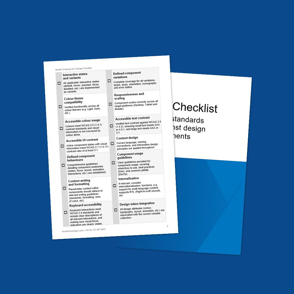
Checklist
☐ Interactive states and variants
All applicable interactive states (default, hover, pressed, focus, disabled, etc.) are implemented as variants.
☐ Defined component variations
Complete coverage for all variations; styles, sizes, orientation, iconography and error states.
☐ Colour theme compatibility
Verified functionality across all colour themes (e.g. Light, Dark, etc.).
☐ Responsiveness and scaling
Component scales correctly across all target platforms (Desktop, Tablet and Mobile).
☐ Accessible colour usage
Colours meet WCAG 2.0 (1.4.1) contrast standards and visual information is not conveyed by colour alone.
☐ Accessible text contrast
Verified text contrast against WCAG 2.0 (1.4.3), ensuring small text meets AAA or 4.5:1, and large text meets AAA or 3:1.
☐ Accessible UI contrast
Active component states with visual information meet WCAG 2.1 (1.4.11) contrast ratio of at least 3:1.
☐ Content design
Correct language, naming conventions, and information design principles are applied throughout.
☐ Defined component behaviours
Comprehensive guidelines detailing component anatomies (states, focus, layout, animation, interactions, etc.) are established.
☐ Component usage guidelines
Clear guidelines provided for component usage, covering when / how to use, best practices (Dos), and common pitfalls (Don’ts).
☐ Content writing and formatting
Placeholder content within components should adhere to relevant writing guidelines (standards, formatting, tone of voice, etc).
☐ Internalisation
If relevant, consider internationalisation, functions, e.g. support for multi-language content, supports RTL (Right-to-Left) layouts, etc.
☐ Keyboard accessibility
Keyboard interactions meet WCAG 2.0 standards and include clear descriptions of all relevant interactions, and making sure visual focus indicators are clearly visible.
☐ Design token integration
All design attributes (colour, typography, layout, animation, etc.) are associated with the correct variable collection.
The power of design checklists
Design checklists are an extremely useful tool for maintaining consistency, fostering collaboration, and helping drive standards. By implementing and using a comprehensive checklist, teams can ensure their design elements are functional, accessible, and aligned with best practices.
This not only increases efficiency but also builds confidence in stakeholders regarding the quality and reliability of the design library. Continuously revisiting and refining your checklist based on new insights and requirements is crucial for staying relevant and effective in a dynamic design landscape.
Want to discuss things further
Do you have other things you’d add to your checklist? What other strategies do you use to keep your design processes consistent? We’d love to learn more.
So please feel free to contact me to share your approach or how we could improve ours.