“The NHS Highland website had existed in its previous form for over a decade. It had long been viewed by the organisation as offering an outdated experience for service users, staff, and stakeholders; with knock-on effects for services and how NHS Highland was perceived.”
Graft – NHS Highland Website Review Report (2021)
In February 2022, NHS Highland published a tender for the redevelopment of its website. This was informed by an in-depth Discovery process and website review conducted by Graft, that elicited and prioritised the needs of users, today and in future.
Factory 73 was engaged to develop a new website, and as long-term partners, we were asked to help ensure a user centred approach was maintained throughout the design and development process. This involved:
- Translating ‘discovery’ research with the public, staff and stakeholders into phased development requirements.
- Developing user needs articulated in ‘discovery’ research into target user personas that guide the user experience.
- Auditing content and identifying how best to implement a user centred approach to information architecture.
- Developing revised content maps, user journeys and page templates.
- Designing key page templates, interactions and user journeys that satisfy the needs of a diverse range of users.
- Gaining input from the public, staff and stakeholders on prototypes to ensure needs are met.
To ensure we were able to deliver the most value within the constraints we adopted the following approach:
Kicking things off
Things got underway with a project kick-off meeting which, at its core, is used to establish a shared understanding of the work to be done, and define how to deliver the maximum value within a project’s constraints. This involved running through the following:
Standard discussion points:
- Key strategic and tactical decisions to be made.
- The purpose and target audience of all key deliverables.
- The project timeline, the critical path, and all key dependencies.
- Risks and how best to mitigate them.
Project-specific discussion points:
- Overcoming geographical, infrastructure and operational challenges.
- Adopting a phased design and development approach.
- Dealing with such a vast and fragmented content library.
- Pending internal decisions and resourcing timelines.
- Defining our approach to design and leveraging the NHS Digital Design system.
- The pro’s and con’s of various approach to exploratory and evaluative research.
- Defining our approach to research and testing for each phase of the project.
This was a highly positive meeting that allowed us to establish a shared understanding of priorities. It also provided the opportunity to discuss key challenges in detail. This informed an updated approach that reflected what was required to make a phased launch plan feasible.
Tip
- Identify client-dependent inputs required to achieve key milestones, then provide the support required to overcome these. On this project, an example of this would be the need to provide content guidelines that would accelerate the optimisation of key content.
- Empower stakeholders to make informed decisions by presenting the pro’s and con’s of different methods. If and when you make recommendations, ensure these are driven by a sound understanding of each project’s specific requirements and desired outcomes.
- Focus exploratory research on low-confidence / high-impact assumptions, leverage evaluative testing for high-confidence and/or low-impact assumptions.
Translating recommendations into requirements
As this was an agile project, the first thing we did was to translate Graft’s website review document into a technical development brief and functional requirements document. This detailed key strategic information and detailed all known functional requirements by phase, into the following categories:
- Content.
- Design.
- Technical.
- Integrations.
- Advanced (wait-and-watch) functionality.
This provided the development team with a concise overview of strategic objectives and desired outcomes. It also enabled the development team to focus on scoping the key functional requirements and integrations required for the launch of a ‘minimum viable product’ without losing sight of the desired future state.
Tip
- Ensure you document strategic, as well as tactical information, to ensure everyone understands the “why” behind the “what” of any requirement.
- Always categorise your requirements – by type as well as priority. As this will help you identify key dependencies (e.g. content) and potential bottlenecks (e.g. availability of resources required to complete the scope of work required).
- Ensure technical requirements are documented in a way that enables development teams to be on-boarded efficiently.
Learning from other health boards
Once preliminary documentation had been defined, we began to build on our prior analysis of the website review document by conducting secondary research. This commenced with an in-depth review of other citizen-centric health board websites. This was used to:
- Analyse key information architecture, content and design decisions across a broad range of health boards.
- Investigate how differing health boards catered for differing populations, geographical settings, and approaches to delivering health and care.
Ultimately, we were looking for approaches, patterns or components that contributed to a positive user experience, versus that had a detrimental impact. For example:
Positive UX
- Always align key content and main navigation options to end-users likely mental models and top tasks.
- Ensure “red routes” (high-visibility options) for likely repeat users (e.g. Patient Hub, Staff log-in, etc), are presented effectively.
- Always provide a persistent search option that provides useful search results.
- Always adhere to accessibility requirements.
- Ensure all interactive elements are styled effectively and adhere to usability conventions.
- Ensure content is not outdated, duplicated and/or fragmented across multiple pages/sections of the website.
- Always ensure alerts and warning messages are worded sensitively and implemented effectively.
Negative UX
- Do not adopt an organisational approach to information architecture.
- Do not use carousels to detail key information (especially when they auto-rotate).
- Do not overload users with too many links competing for attention in close proximity.
- Do not use unfamiliar terms or labels that are unlikely to be instantly understandable to citizens.
- Do not use decorative images that unnecessarily increase page load times.
- Do not create “siloed” content that does not help a user identify what to do next.
- Do not recreate content that is published, and more actively governed, on third party websites.
Tip
- In addition to documenting best practices, remember to document any issues encountered too. As this will help you identify what not to do, as well as what should be done.
- Remember there is no one right way … every health board website should be designed to respond to the specific geographical, social and operational realities of each area.
Designing and building services for the NHS – meet NHS Digital
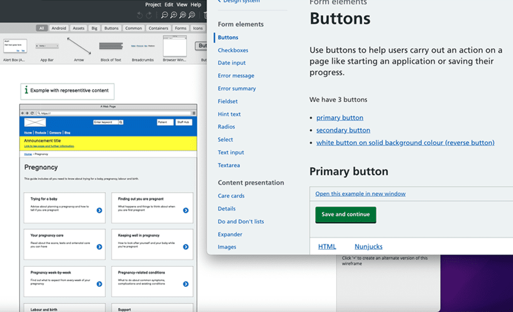
The NHS Digital service manual is an incredible resource that empowers designers to learn from the research and experience of other NHS teams. This includes the NHS Design system, that provides detailed guidance on how to build consistent, usable and accessible user interfaces. Most importantly, all of the patterns, styles and components detailed within it have been tested and provide known solutions to common needs.

Therefore, as soon as we got the green-light from NHS Highland we started the process of testing the prototyping kit and investigating how this should inform our approach to producing design deliverables. Our initial inclination was to skip to code as the availability of a pre-tested visual language ensured we’d be able to focus on designing and testing journeys, and not the usability of particular interface elements. However, upon further investigation it soon became apparent that despite this being a technical accelerator, using it to showcase how the underlying information architecture of the website could be optimised wasn’t the right approach to take. So, it was at this stage that we made the following decisions:
We would use wireframes to:
- Visualise proposed changes to the information architecture of the website.
- Define what core information (mandatory and/or optional) should be displayed per page template.
- Showcase how key functionality on the website would be reached and work.
These were provided in an editable format so all stakeholders could contribute to this process efficiently.
In addition to this it was also decided that the new NHS Highland would:
- Be aligned to NHS Digital’s design system and re-use all accessible and pre-tested styles, components and patterns.
- Use the NHS.UK prototype kit as and when applicable.
- Use NHS.UK frontend library production code.
These were styled to align to NHS Digital’s design system so these would be representative of the interface and visual language to be used. This allowed us to rapidly visualise proposed changes to the information architecture of the new website and then share these with internal stakeholders for feedback and further iteration.

Tip
- The NHS Digital service manual is actively maintained by a dedicated service manual team. Make sure you and your team revisit this invaluable resource whenever you kick off a new health and care project, as it is constantly being updated and extended.
- Choosing how you prototype proposed changes is a critical decision that should be influenced by a myriad of factors, e.g. skills and resources available (e.g. design, technical, etc), likely effort per option, scope/scale of change to be showcased, risk, what is the appropriate level of fidelity to use, what is the feedback and testing process, what tools are available, etc. Always consider what you’re prototyping, and why, prior to selecting how you’re going to prototype proposed designs.
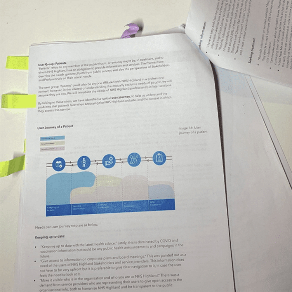
Understanding context
Graft’s website review report provided a valuable overview of the distinctive characteristics of the NHS Highland area; including geography, demographics, digital connectivity and digital exclusion, and their implications for the future website. This information was supplemented by further research into digital connectivity and mobile coverage across the NHS Highland area. Doing this informed key content decisions, for example, the use of unnecessary decorative images was not recommended, as this would make the website unnecessarily slow to load in low-bandwidth environments.
In addition to this, we collaborated with NHS Highland to build a deeper understanding of delivering health and care services across some of the most remote and sparsely populated parts of the United Kingdom. This involved investigating:
- Key scenarios and triggers that would prompt people to engage with NHS Highland.
- How location, infrastructure, and digital maturity was likely to influence health and care journeys.
- Key variables that were representative of the varying levels of friction people would encounter when engaging with NHS services online or offline, e.g. levels of independence, travel time, travel options, connectivity, etc.
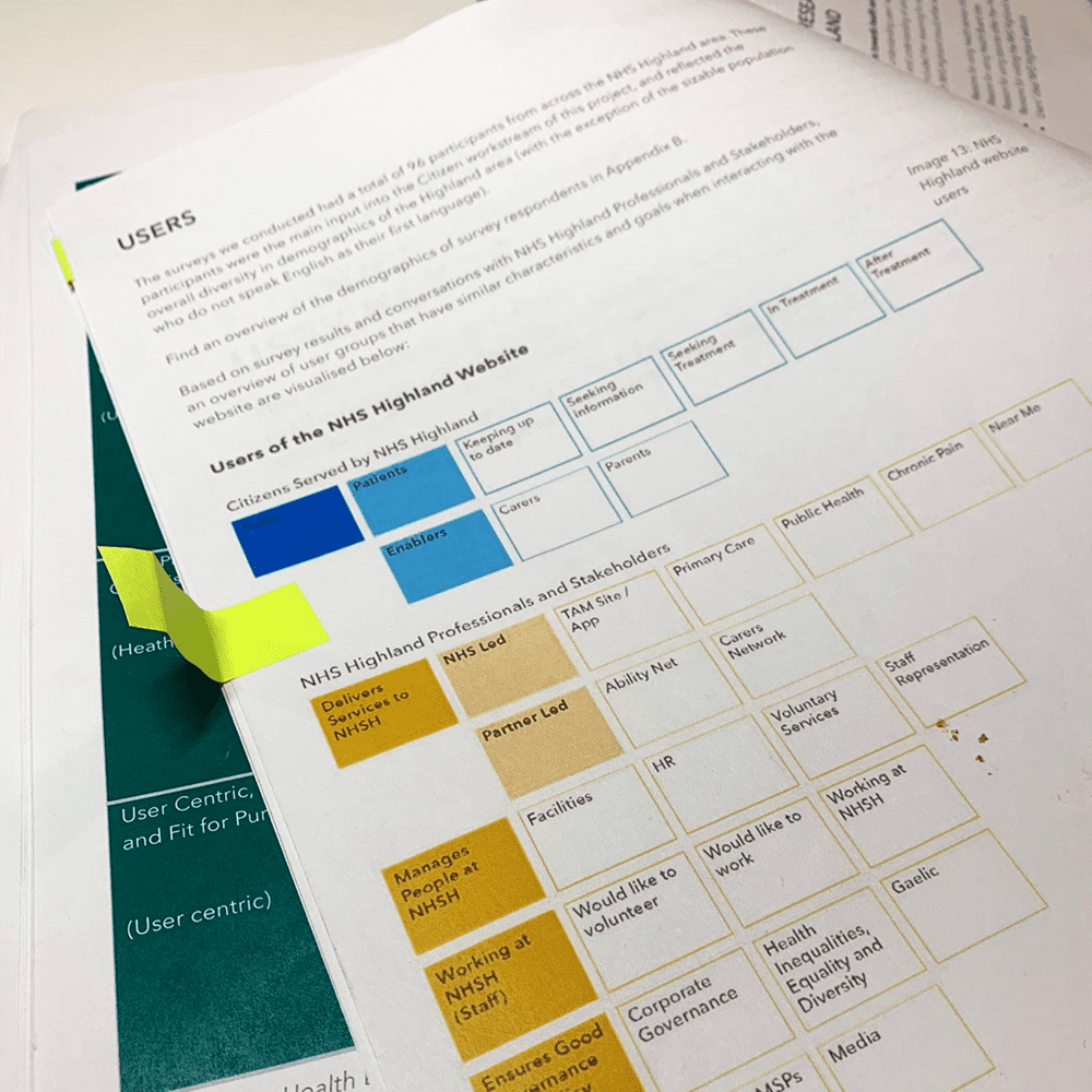
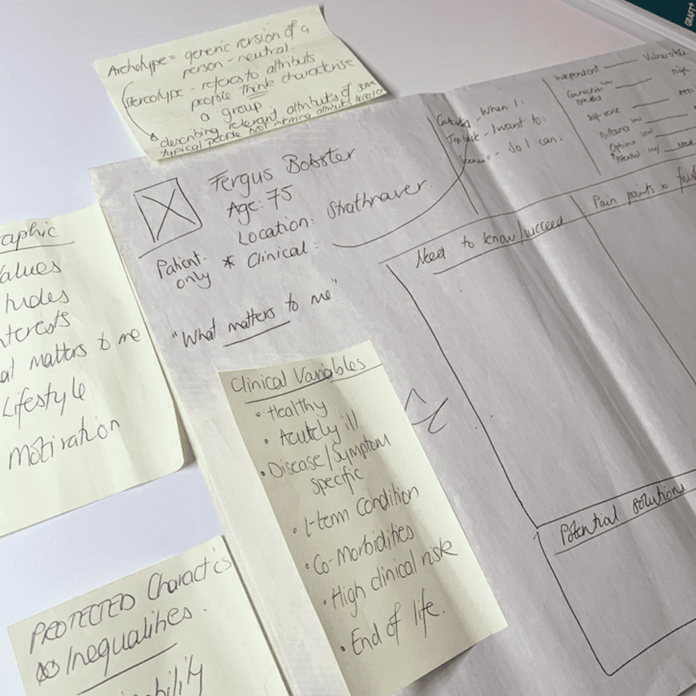
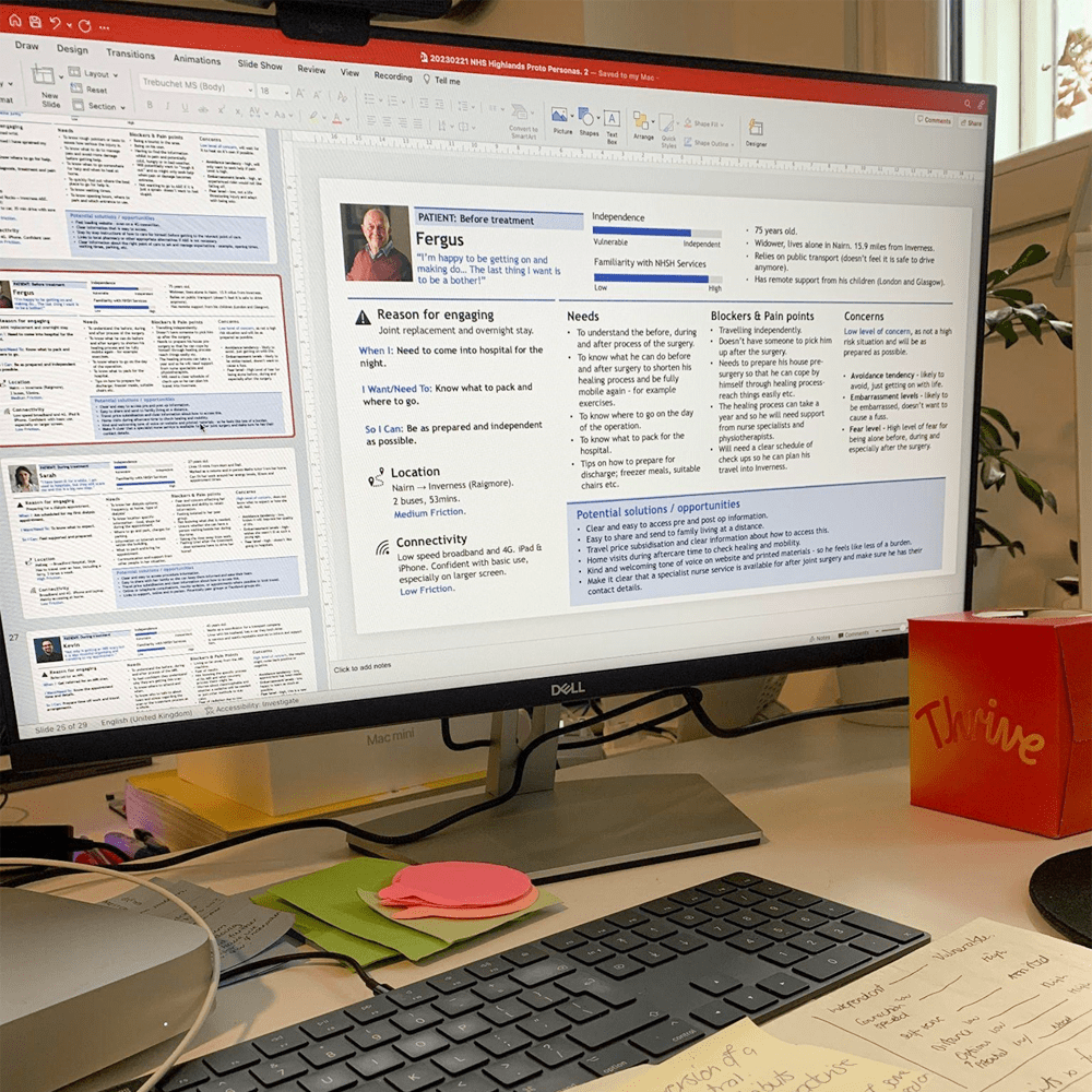
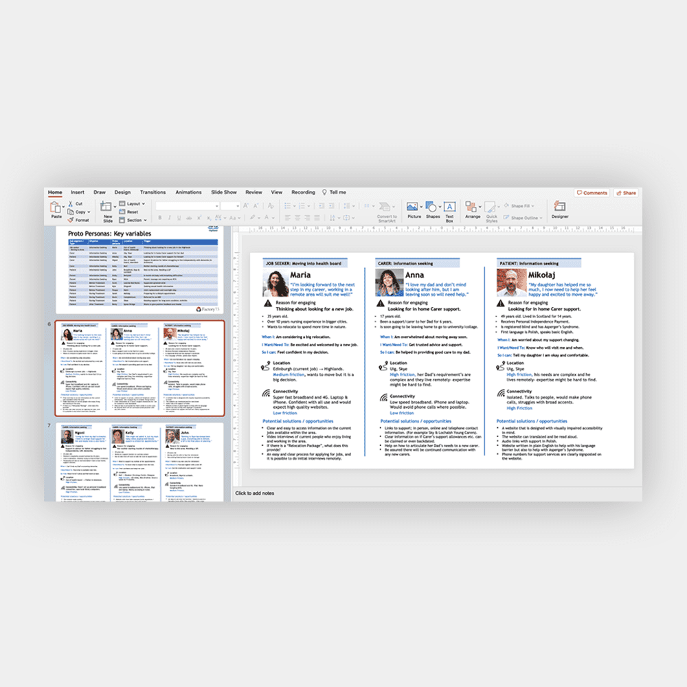
This research was developed into 15 proto-personas that detailed the needs of archetypal characters. These were not only useful for highlighting the disparate needs of users, they also detailed a compelling case for why the website had to be focussed on the needs of citizens.
Tip
- Review the information at your disposal, identify any gaps or low confidence assumptions and then identify if and how you could fill these.
- Do not rely on what reports tell you … research we conducted highlighted that there was a substantial disconnect between what reports and speed tests claimed and people’s “on-the-ground” experience.
- Work with domain experts to define a broad range of archetypal scenarios, triggers, and journeys. Then investigate how key variables could influence these, e.g. location, friction, etc. As this will allow you to identify the breadth of needs that must be met.
Overcoming the noise of over 2,800 web pages
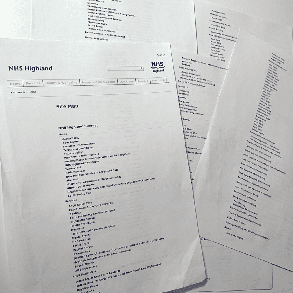
One of the greatest challenges to launching a new NHS Highland website was the volume of content that had to be analysed and optimised. Over the years this had grown to over 2,800 web pages. Given the volume of content, and the fact that different content teams had written and published these pages, it was no surprise that this had knock-on consequences.
For example:
- The information provided was often inconsistent or incomplete.
- The formatting and styling of content was not always usable or accessible.
- Pages were not always assigned to the right section of the website.
- Content was unnecessarily fragmented across multiple pages.
- Multiple pages with the same name, yet different content, had been published.
To ensure we were able to develop a user centred approach to information architecture, as well as address known issues, we needed to audit all of the content on the existing website through the lens of the proto-personas developed. We adopted the following approach to ensure this activity delivered the maximum value and expedited the content migration process. This was achieved by analysing the existing site map and identifying the following information per page encountered:
- URL.
- Current page reference.
- Current page name.
- Topic.
- Recommended action point (Delete page, Move page, Update page, Move content to more relevant page, To be discussed/confirmed).
- Notes.
Doing this enabled us to identify:
- What pages and content were more actively governed on third party websites
- What pages and content should be deleted
- What pages and content the new website must provide
- How best to implement a user centred approach to labelling and organising content
- The proposed reference, page name, and key content blocks required for each and every web page on the new website.
This process resulted in a leaner, user-focussed site map that was designed to accommodate a phased approach to content migration.
Tip
- A content audit takes a substantial investment of time … do not underestimate or shortcut this … doing so will result in compromised findings.
- When analysing content don’t just log issues, try and identify the root cause of the issues you encounter.
- Collaborate with domain experts to secure buy-in for alternative approaches to labelling and organising information from an end-users perspective.
- Always address duplicate pages or the unnecessary fragmentation of content across multiple pages.
- Try and identify what content must be published (and therefore governed in-house), e.g. local information, and what content should be linked to (governed externally), e.g. national information.
Visualising proposed changes
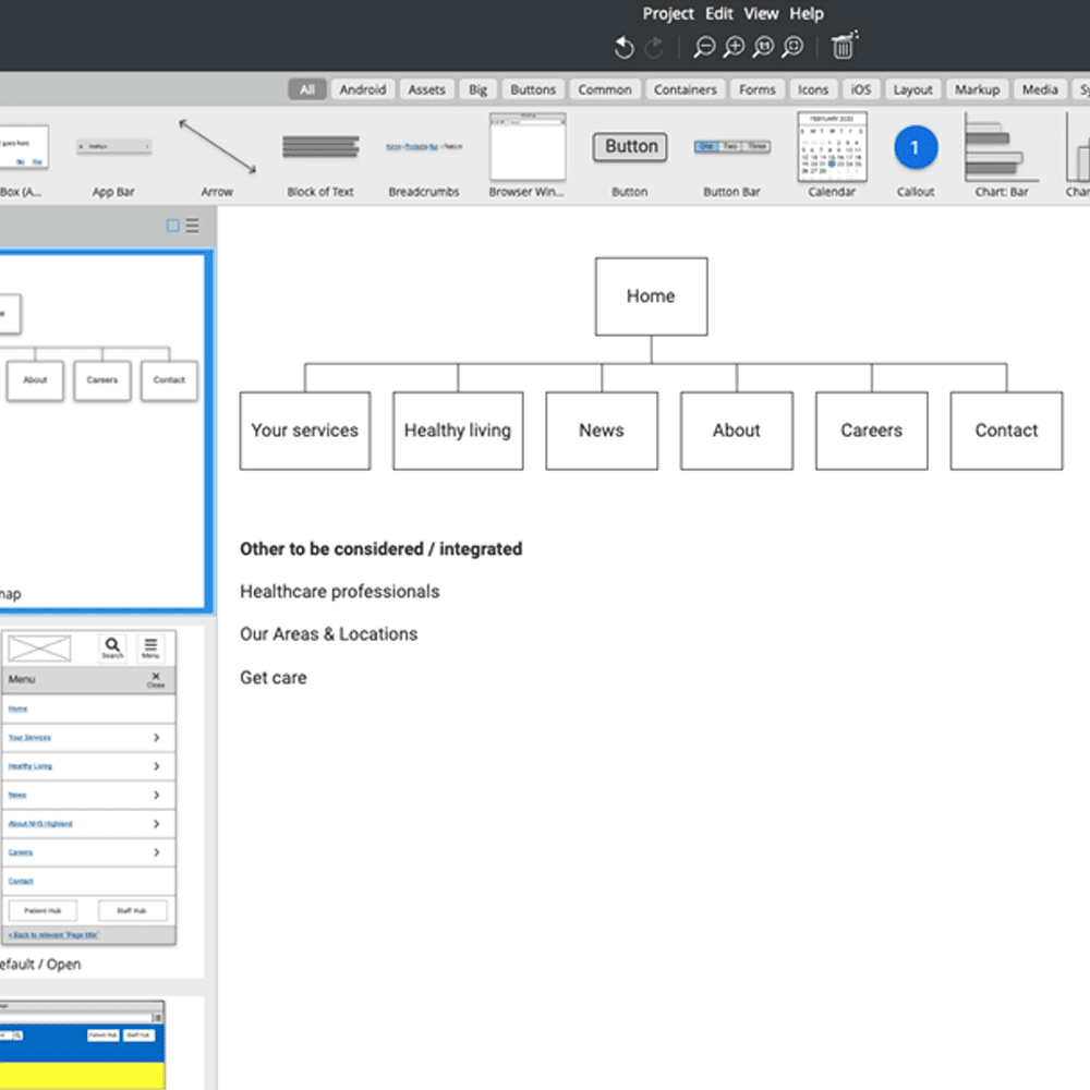
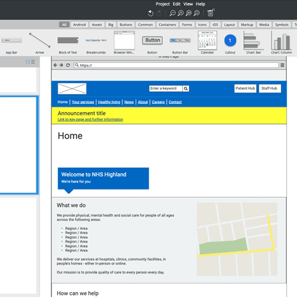
Once a revised site map had been defined we were ready to start visualising key page templates so that we could finalise the content blocks required per page template. The following elements and page templates were developed:
- Global (header and footer navigation).
- Main navigation.
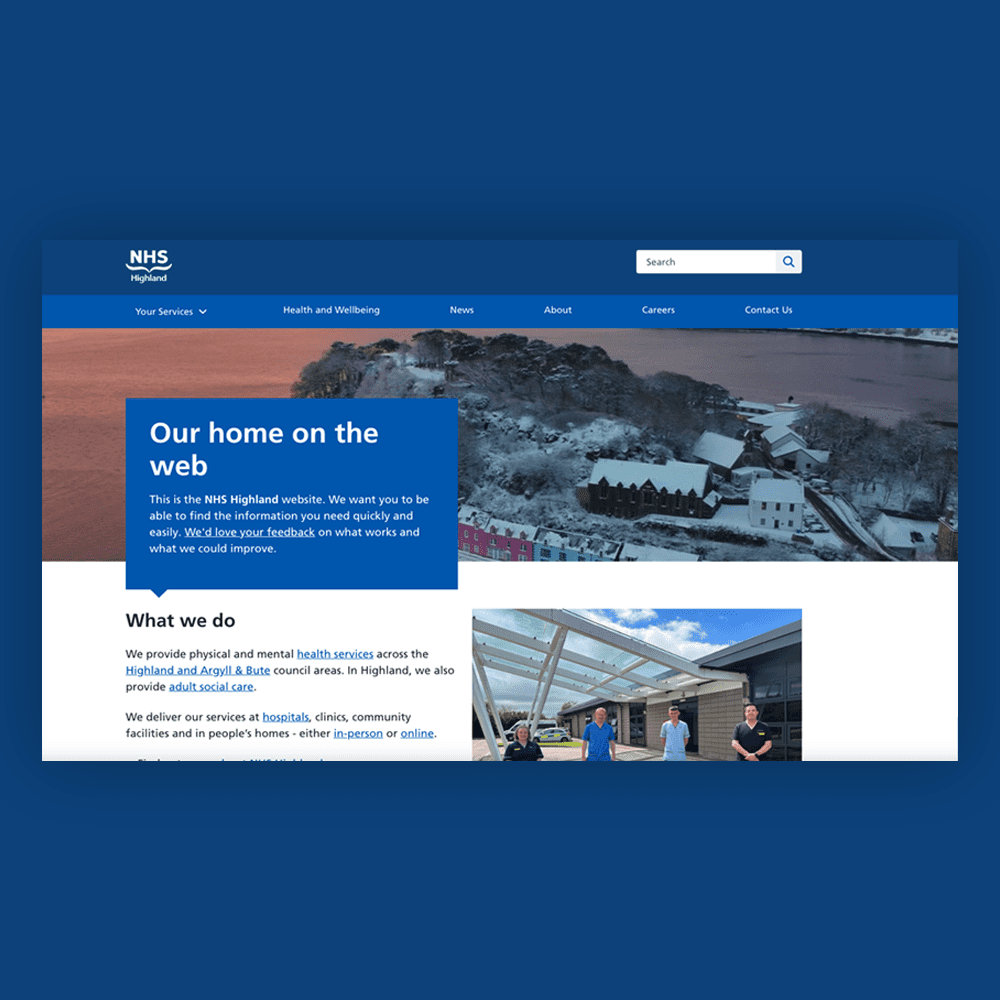
- Home.
- Your services parent page.
- Services child page example.
- Know who to turn to.
- Get care.
- Find local services parent page.
- Find local services child page, e.g. find a GP.
- Advanced search.
- Services A-Z.
- Healthy living parent page.
- Healthy living child page example.
- News and events.
- Article template.
- About parent page.
- About child page template.
- Work with us.
- Staff (information for) – role specific landing page.
- Carers (information for) – role specific landing page.
- Contact.
- Locations.
- Location child page template.
In addition to this, we also designed a catalogue of reusable blocks that could appear across the website as and when applicable. This included components such as:
- Information, warning and urgent alert panels.
- Requests for feedback panels.
- Call to actions.
- Content governance details, e.g. last updated, updated by, etc.
- Social media integrations.
- Related page/news blocks.
- I’m looking for / Quick find options.
These were developed in a low-fidelity wireframing tool to ensure:
- It was efficient to develop and iterate on proposed designs.
- Focus was maintained on the organisation and layout of information, not how it was styled.
- All stakeholders involved could actively contribute to the refinement of proposed wireframes.
We worked closely with stakeholders to refine these proposed page templates and key components prior to their implementation by Factory 73.
Tip
- Consider sketching out ideas before starting to develop your digital wireframes.
- Re-use pre-tested patterns, components and styles.
- Define header and footer elements prior to defining the body content per page template.
- Use a min. font size of 16px for body content on mobile.
- Craft your headings, sub-headings and micro-copy.
- Adopt a mobile-first approach to wireframing, then scale up to desktop.
- Where possible use representative content, not “lorem ipsum”.
- Define the core (mandatory and optional) content required per page template.
- Hot link your stand-alone wireframes to showcase how the website will work.
Adopting a phased approach to launch
A rapid development process ensured a staging website was soon available for testing. A rigorous quality assurance process was implemented to identify any unforeseen issues and ensure all accessibility requirements had been adhered to. Once this process was complete NHS Highland was able to start migrating content prior to a public beta launch and open testing.
“It is really important to us at NHS Highland to put people using our services first, and to design services around their needs to give them the best experience. The website is a key place to demonstrate this and we’ve had lots of positive comments about how straightforward and easy to use the new site is.”
Ruth Fry – Head of Communications and Engagement, NHS Highland
To minimise risk and disruption it was agreed:
- To maintain an archive of the old website. This meant that all legacy content that had not been published on the new website was still available should it be required.
- That as and when new pages were published on the new website, these would be removed from the archived website.
This approach ensured it was possible to launch a publicly available website, before iterating and extending functionality and content further through successive development rounds based on user feedback, website analytics and organisational needs.
To capture the feedback required to inform future development rounds, we defined the following:
- An analytics measurement model: this detailed metrics and key performance indicators that would help NHS Highland understand “what” people are doing on the new website. This included key performance indicators such as interactions per visit, success rates, time on task rates, etc.
- A series of survey question-sets: this included task-specific, non-task specific and generic online surveys that would help NHS Highland understand “why” people were doing “what” they were doing.
- Topic guides: this included scripts and question-sets for pre and post launch interviews that would help NHS Highland explore how the website could be improved.
These automated feedback loops were deployed by Factory 73 and an ongoing feedback capture process was implemented by the Communications and engagement team at NHS Highland.
Tip
- Identify knowledge gaps and then identify who you need to conduct research with, and what questions you need to ask, to close these gaps.
- Avoid vanity metrics … identify key performance indicators.
- Ensure feedback loops are actively monitored. As and when issues arise, ensure these are analysed appropriately and any remedial action(s) are added to a backlog for future prioritisation and implementation.
- Use qualitative research to complement quantitative research.
- Ask questions that help you understand “who” is providing input, e.g. it is important to know if you are capturing the feedback of a healthcare professional vs. a citizen.
- Establish a baseline, then compare data to relevant time-periods … seasonal traffic patterns matter.
The long-term roadmap
The new website is already out of beta and is now NHS Highland’s primary digital touch point. But this isn’t the end of the process, in fact it’s just the start. As Factory 73 and NHS Highland continue to extend the website, we’ll be on-hand to:
- Analyse and respond to inbound feedback.
- Design new page templates and functionality.
- Optimise the information architecture of the website to accommodate the integration of new content and digital services.
We will also be collaborating with NHS Highland to ensure we share any assets that could be of value to those working on similar projects in the future. In the meantime, should you wish to learn more about this event or any of the outputs detailed please feel free to contact us.
“Border Crossing UX’s thoroughness, commitment to adhering to NHS digital design standards, and impressive knowledge of the Scottish Approach to Service Design were instrumental in delivering a truly user-centred website. Their professionalism, attention to detail, and expertise surpassed our expectations. Their contributions, including translating research into phased requirements, developing target user personas, and implementing comprehensive information architecture, have made a significant impact. We highly recommend Border Crossing UX as a trusted partner for delivering outstanding results.”
Graeme McClurkin – Managing Director, Factory 73