What are tokens
Design tokens are the single source of truth of your design language within your design system. They contain all your design values like colours, spacing and typography. Instead of hard-coding values (e.g., #0076c0), you use a token like color-brand-primary.
Tokens can then be transformed into a CSS variable, creating a single source of truth for your design decisions, ensuring consistent branding and efficient communication between design and development across platforms.

Token types
While many methods exist for implementing design tokens, our specific goal was to uncover how best to configure a system that inherently supports multi-brand scenarios, responsive design across devices, and effortlessly switches between modes like light and dark – all within one cohesive system.
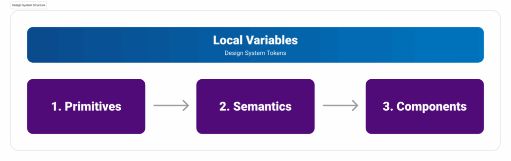
Primitives
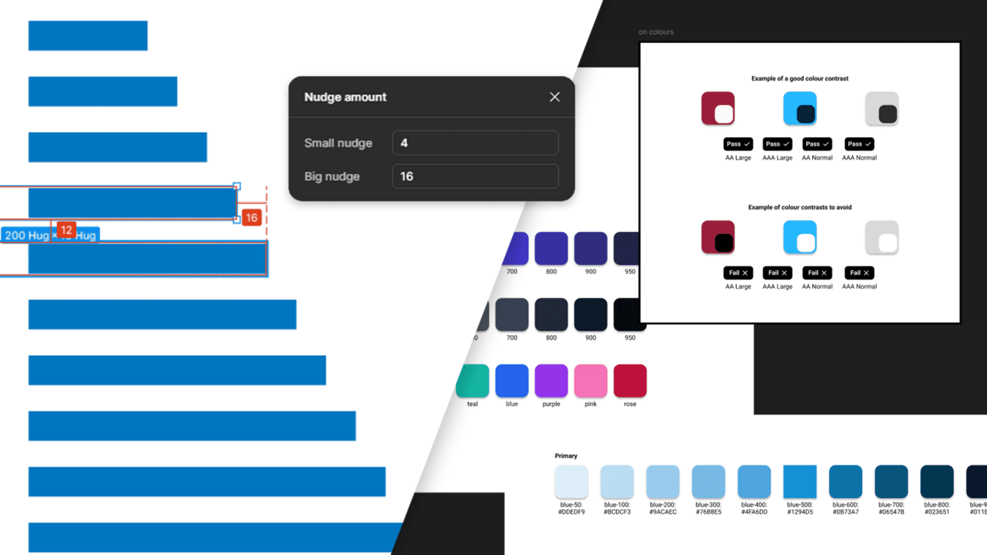
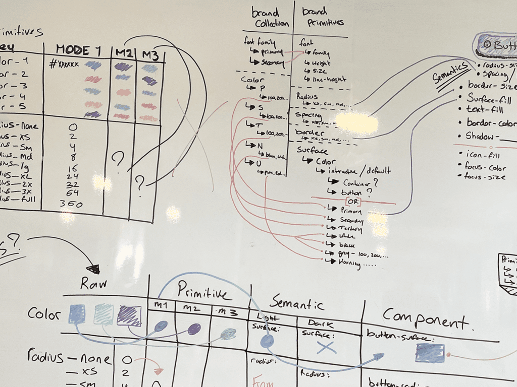
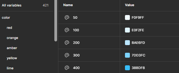
Primitives are the foundational building blocks of a design system, which contain the raw values not tied to context. The source for the core design attributes like specific colour hex codes, exact font sizes and families, precise spacing units, defined border widths, and consistent border radii. These tokens store the absolute values that all other tokens will reference, ensuring a unified and consistent base. This means if you simply change a primitive value, for example, a core blue colour, that single update will automatically cascade and affect every element throughout the system that references that primitive.
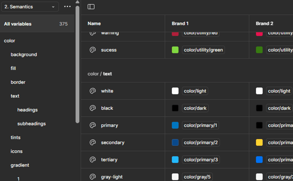
Semantics
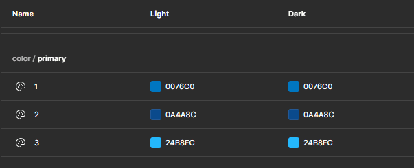
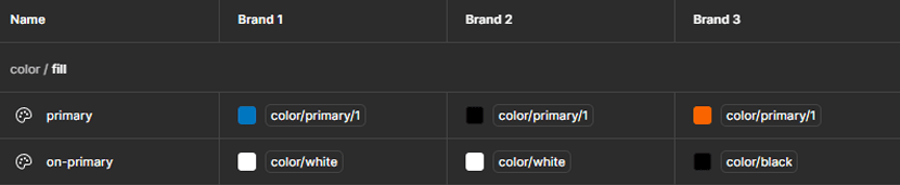
Semantic tokens provide the contextual layer for your design system. While they inherit their values directly from the Primitives group, they are named based on their purpose rather than their raw value. For example, instead of “color-blue-500”, you might have “color-text-brand-primary”. This setup allows you to update your underlying primitive values without breaking the connections to your components and foundational styles. Semantic values function as a bridge, ensuring your design system remains flexible and scalable. They offer immense flexibility for introducing alternative brands or managing different display modes like light and dark. All whilst keeping the underlying structure intact.
Components
Component tokens are the most specific layer, directly applying values to individual components. These tokens draw values from the Semantics. They offer precise control over a component’s appearance, ensuring that each element, button, or card uses the exact values it needs. By linking component-specific properties to your token system, you gain control over granular styling and maintain consistency across all instances of components. Crucially, these tokens can also reflect a component’s behaviour or state, allowing you to define distinct values for interactive elements – for instance, how a button looks when it’s in a hover, pressed, or disabled state.
Naming conventions
Naming conventions are incredibly important in design systems serving as a bridge between design and development. Our goal is to ensure that the names we use clearly communicate intent and function, making it easy for developers to understand what has been built using the language and logic they work with daily.
Some examples of this include:
- –color-blue-500;
- –font-weight-bold;
- –radius-lg;
- –background-color;
To further bridge the gap between design and development, we aimed to standardise naming conventions on CSS best practices. Tailwind CSS, with its clear and intuitive structure, was our inspiration. Our goal was to replicate its effective conventions within our design tokens and variables.
In doing so, we had to take a few key things into consideration:
Americanised spelling
Adopting Americanised spelling across our tokens ensures consistency throughout our codebase and reduces potential errors for developers who are often accustomed to this standard.
Consistency
A consistent naming structure is paramount for maintaining an organised system, making it easier to manage all files and components as the system evolves.
Findability
Our naming choices prioritise ease of search, enabling designers and developers to quickly locate specific tokens or variables within the system.
Collaboration
A standardised naming convention fosters better teamwork, providing every team member with a clear guideline to follow, which in turn helps maintain consistency across the entire system.
Scalability
We designed our naming convention to support future growth, ensuring that it can easily accommodate additional variables and expand gracefully as the design system matures.
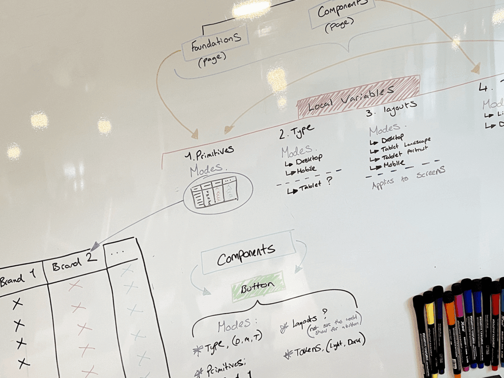
Our token system approach
After extensive research into various methodologies and rigorous testing, we have established a token system structure that achieves our goal of supporting a multi-brand, responsive, and adaptable multi-mode system that extends beyond conventional light and dark themes to seamlessly support accessibility requirements like high contrast, colour blindness, grey scale, or dyslexia modes, ensuring more inclusive screen design for users.
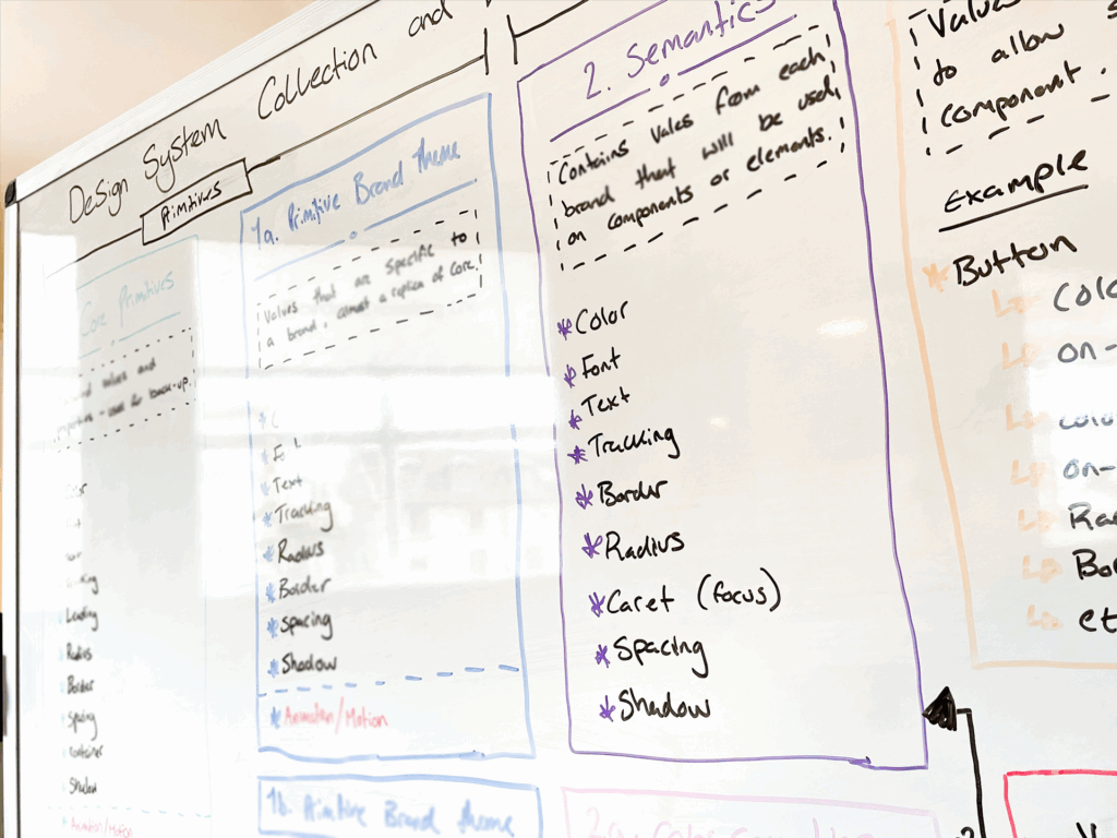
0. Primitives Core
The core primitive collection is referenced from Tailwind CSS, which is our chosen default framework; however, this could be re-configured to use another desired framework such as; Bootstrap, Foundation, or Bulma CSS. These values serve as the default styling foundation for the system. Crucially, they also function as a robust fallback for specific style groups a brand might not extensively define. For example, if a brand lacks a comprehensive spacing system, they can confidently use these values, ensuring best practices and consistent values are maintained across all brand experiences.
1. Primitive Brand
Our brand-specific primitive collection mirrors the structure of our core primitives, but uses values uniquely tailored to reflect a brand’s style guide. If a brand lacks an extensive colour palette or if a chosen colour does not meet web accessibility standards, we are able to take a value from the core primitives to replace that particular value.
2. Semantics
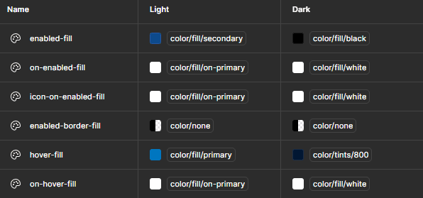
This collection houses our semantic tokens, which provide the crucial layer of context and meaning within the design system. These tokens are inherited from the brand-specific primitive tokens and are assigned to modes to then determine what brand style to use. This approach ensures that elements consistently reflect the active brand and mode (e.g., light, or dark) across all colours, text styles, spacing, borders, radii, and even page breakpoints and guides.
3. Component Specific
This collection represents the component layer in our structure. These are values that are directly applied to individual components within our system’s library. These tokens pull their values from either the semantics or custom semantics collections. By leveraging different modes, the system ensures that each component automatically displays the correct styling for the active brand, the components behaviour state, and light/dark or other modes. This provides granular control and consistency for every element built.
4. Pages
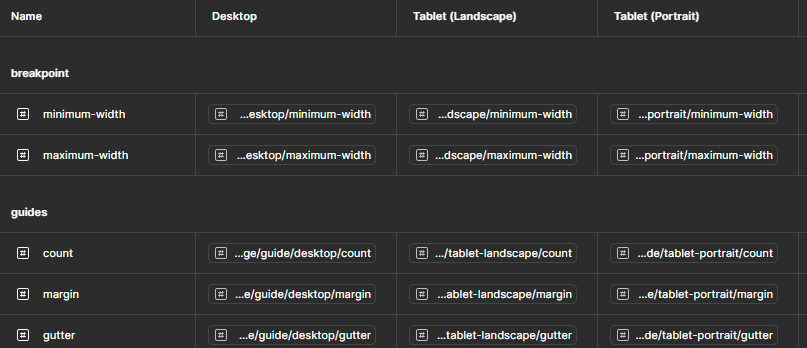
This collection is dedicated to the responsiveness tokens, specifically managing how our design adapts across various devices. It pulls semantic values for crucial elements like page breakpoints, grids, and overall layouts. This allows our system to dynamically adjust based on the device size and use case, effectively changing its mode depending on whether it is viewed on a desktop, tablet, or mobile device.
5. Typography Styles
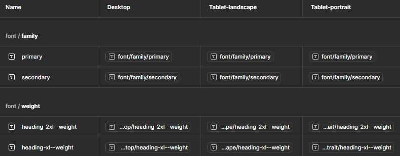
The typography collection, another key set of responsive tokens, provides comprehensive control over how text appears across the entire system and on various device sizes. It uses semantic values to ensure typography adapts seamlessly to the active brand, the specific device it is viewed on, and even adjusts its visual presentation based on modes like light or dark.
Final thoughts
As we have explored, effectively managing design tokens goes far beyond simply defining variables. It is about creating a strategic, layered system. That serves as a single source of truth for your design language, significantly transforming the design experience within Figma. Our journey to combat unruly token growth led us to an architecture that supports multi-brand scenarios, responsive layouts, and mode switching from a unified foundation.
By structuring Primitives, Semantics, Component tokens, and adopting a developer-friendly naming convention, we are creating a system that is organised, scalable, consistent, and collaborative.