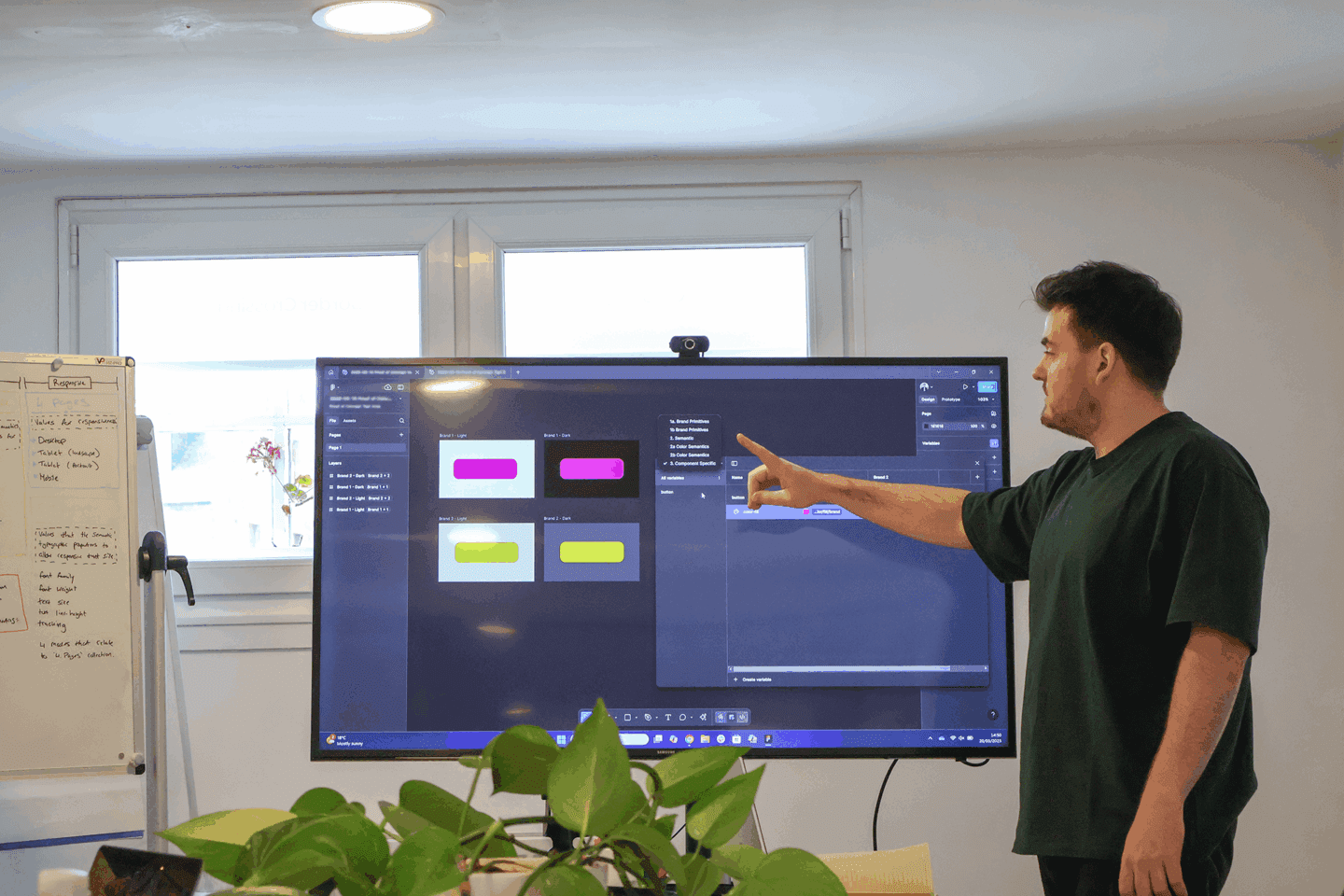
Figma nudging
A great handy trick that is hidden away is nudging. We all do it, shifting elements with the arrow keys, pixel by pixel.
But recently I found out there was an option for small nudges and big nudges! And you can even customise them to your nudging preference.
What is nudging
Nudging in Figma, is simply the method of moving elements and components around on your page by using the arrow keys. It allows you to get that pixel perfect precision when aligning things together.
Customising nudges
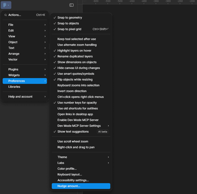
To edit your nudge sizes, simply go to the Figma dropdown at the top left of your window. Within ‘Preferences’ you will see ‘Nudge amount…’ Once you click on that, a window will appear that allows you to adjust the nudging values.
Using nudges
To use your small nudge amount: use the arrow keys alone. By default, this will be 1px. To use a big nudge: hold down the shift key while using the arrow keys and this will move your elements around your page 10px by default or the number you have input to your big nudge amount.
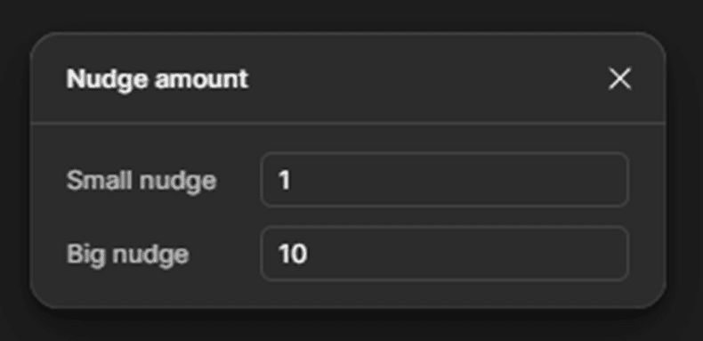
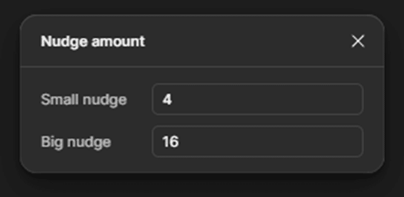
This is very useful to know, and you can change it for each project you work on. For example, if you are designing in an environment with a grid or spacing layout that is using increments of 4px, you can set your nudge amounts accordingly.
On-colour values
Gaining an understanding of using “on-colour” values has proved to be incredibly useful when crafting foundation styles for our design system, especially for defining various states, elements and component variants.
It moves you from making individual colour choices to building an intelligent, interconnected colour system that prioritises accessibility, efficiency and consistency.
What is an on-colour value?
An on-colour value is simply the colour that is used “on” another colour.
For example, if you had an “surface-warning-colour” on a button, there would also be a “on-surface-warning-colour”. These are applied to elements such as text or icons that are on the button surface.
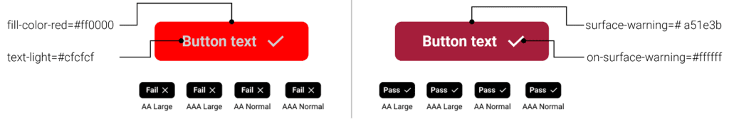
Having an on-colour reduces the risk of poorly selected colour combinations that impact on usability.
Our use of on-colour values stems from best practices established by industry-leading design systems, in particular Google’s Material Design and IBM’s Carbon Design System. Both frameworks define and utilise on-colour tokens, and their approach has informed how we apply and manage colours for optimal contrast and accessibility within our system.
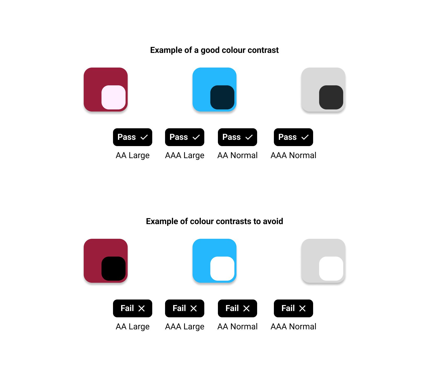
When designing it’s critical that you check the colours you are using pass Web Content Accessibility Guidelines (WCAG) standards.
https://webaim.org/resources/contrastchecker/
Different examples of on-colour values
The true power of these values becomes evident when you see how they are applied across a spectrum of design elements. Far from being limited to just text on a background. You’ll find them working in tandem with your core palette to define everything from interactive states to status indicators:
- primary-colour > on-primary-colour (e.g., text/icon on a primary button)
- secondary-colour > on-secondary-colour (e.g., text/icon on a secondary action)
- tertiary-colour > on-tertiary-colour (e.g., text/icon on a tertiary accent)
- surface-colour > on-surface-colour (e.g., body text on a general background or card)
- container-colour > on-container-colour (e.g., text/icon within a distinct container element)
- success-colour > on-success-colour (e.g., text/icon on a success notification)
- warning-colour > on-warning-colour (e.g., text/icon on within a warning banner)
Using these values allows you to make sure that when an element is being used with another colour, there will not be contrast issues that compromise accessibility. It keeps your system consistent and eliminates guesswork for designers and developers. This helps build a unified visual language and reduces inconsistencies. It will also help simplify updates to themes such as light and dark mode, when maintaining your library.
Colour ramps
Introducing colour ramps has helped create versatile, accessible and consistent elements within our design system. Giving us precise control over the palettes and the colours used throughout library elements and their different states.
What is a colour ramp?
A colour ramp is a set of colours that are variations of a single base colour, typically ranging from tints (light colours) to shades (dark colours). With your base hue sitting in the middle of your tints and shades. For example, your base colour could be blue-500.
Using colour ramps
Colour ramps are created by using colour tints and shades. These are colours that are lighter tints and darker shades of a base/root colour. For example, you could turn your primary colour in to 6, 8, 10, 11 or 12 separate colours.
A ramp of about 10 colours, provides plenty of range for designers, and is a manageable number for developers to implement efficiently. Going beyond this risks introducing unnecessary complexity.
The base/root colour is the first colour value in each row of the tints and shades, showcased in the image above.
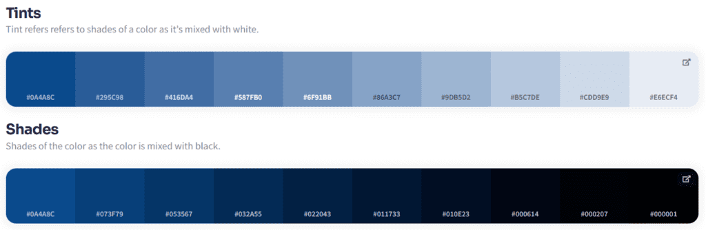
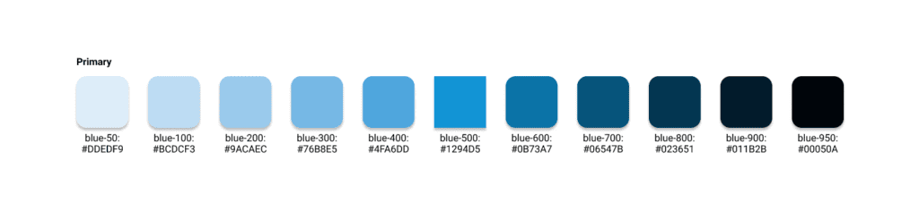
Next, give each individual tints and shades a number value to indicate where in the spectrum it sits. For example, your lightest colour can start at 100 and continue up until you reach the darkest colour value.
Example of values:
100, 200, 300, 400, 500, . . .
10, 20, 30, 40, 50, . . .
Using tens or hundreds as digits allows you space for adding extra colours in-between if required:
50, 100, 150, 175, 200, 250, 300, . . .
5, 10, 15, 17, 20, 25, 30, . . .
Pairing colour ramps with on-colours
Using colour ramps with “on-colour” values, ensures optimal contrast – think dark text on light backgrounds and vice versa. This method also dramatically simplifies adding light and dark modes to your designs, streamlining workflow and guaranteeing consistent legibility.
Quickly generate colour tints and shades with this helpful site. It produces these variations automatically and gives you the specific colour values needed for your design work.
Colour Shades Generator (Free Online Tool)
This site provides you with a summary of the colour as well as a list of tints, shades, hues and complementary colours that can be accessed via the “Full Colour Details” option.
Final thoughts
Using the Figma nudging, understanding the ‘on-colour’ technique, and leveraging colour ramps will significantly streamline your workflow. You’ll find yourself using less keystrokes, moving elements with precision, creating designs with consistent spacing, and applying colour in a way that adheres to contrast best practices.
So, give these simple tips a try and see how they streamline your workflow and colour selection process in Figma!