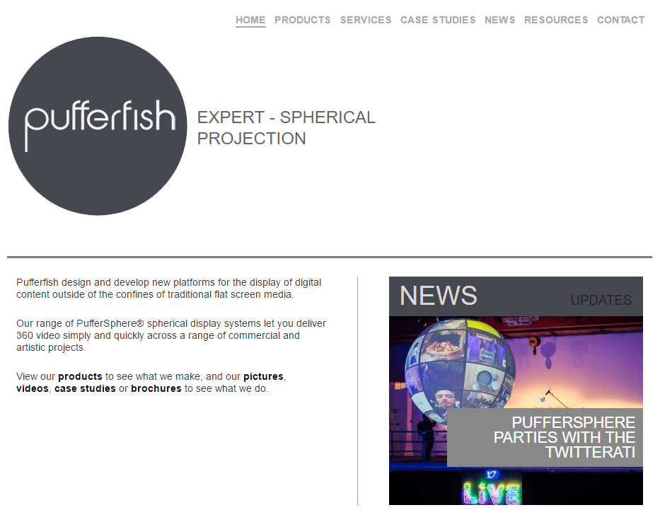
Pufferfish Displays produce eye-catching spherical displays and content for clients such as Disney, Coldplay and Eurovision. When you see one of their products – you’re guaranteed to stop and stare.
How it all began
Pufferfish contacted us to see if we’d be interested in cloning their old website, on a private sub-domain, so they could play around with WordPress. They’d heard all the hype but wanted to see what all the fuss was about.
In no time we cloned their website and trained their team to administer it. Within a matter of days, it became clear which tool they wanted to use and a few months later we were asked if we would consult and where necessary assist with their migration to WordPress 3.0.
The design process
Our work started by collaborating with Pufferfish’s in-house design team. We helped them consolidate their original information architecture and define how best to showcase their future work. This was a tricky process but in the end, a compromise was found in terms of balancing aesthetics with usability. We then produced content development guidelines for the new website.
How the project evolved
Initially, Pufferfish were planning on undertaking the coding themselves, but the arrival of an unforeseen deadline left them in need of some efficient expertise. The prospect of a feature spread in the inaugural iPad edition of Wired.co.uk meant they needed their new website deployed as quickly as possible. What’s more, they also needed a scaling strategy for the website to cope with a sudden peak in traffic.

Getting our hands dirty
Thankfully this is something we’re used to and within 3 weeks we had a fully stress-tested website that would do the job. Following some last-minute content production and much-needed usability enhancements the new website was deployed.
By leveraging WordPress 3.0′s support for custom post types we created a highly customised installation that will maintain rules for all of Pufferfish‘s publishing. This should ease the operational burden of publishing, and perhaps more importantly, the governance of their website content in the future.
Closing thoughts
Getting a much-needed overhaul of their website was critical to Pufferfish and we’re glad we were able to help them do this. They now have a design in place that befits their products and the success they’ve enjoyed as a company. They’ve got a lot of exciting plans for the future and we look forward to seeing how their new website is used to communicate these.
For more information about this project please contact us.


