
UX Scotland 2023 brought together a diverse group of UX professionals, thought leaders, and enthusiasts to explore the multifaceted landscape of User Experience design. Over the course of three days, attendees immersed themselves in inspiring talks, engaging workshops, and thought-provoking discussions. While it’s difficult to write a single blog post summarising the 45+ sessions that were held, our attending team took a day to reflect on and discuss all their learnings following the event and we found three core themes emerged:
- Communities, Culture, and Psychological Safety;
- Accessibility and Inclusion;
- AI, Mixed Realities, and the Future of UX.
In this post, we’ll share our common findings and learnings around each theme, uncovering the invaluable insights we learned and their potential to shape the future of UX design.
Links to presentations and speaker profiles have been provided where available.
Theme 1: Communities, Culture, and Psychological Safety
Building Community and Psychological Safety:
Tricia Okin’s impactful talk, “Get in where you fit in,” explored the crucial role of organisational culture in fostering job satisfaction and fulfilment. The alignment of personal values with team culture emerged as a significant determinant of individual success.
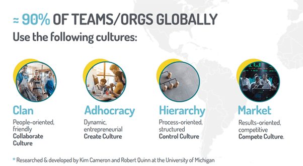
Organisational culture says a lot about your team and what you value, and job seekers can pick up on that almost immediately as values make a huge difference in how we work. We tend to select work based on how exciting the work itself is or the benefits offered by taking on the work, whereas what really brings the most fulfilment is finding the right culture fit for our style of working. Taking a step back to reframe for growth and opportunity can help individuals and teams so it’s useful to look at where teams are aligned and what areas are for improvement. This can be done by defining and assessing the current culture, financial goals, company structure, mission and core values.
“Feelings are a strength that can be used to create a better work culture. “
By being more self-aware, individuals can become better colleagues, employees, and managers. It is important to be open and vulnerable with thoughts and feelings in order to let those around you treat you in the best way they can.
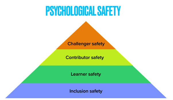
Despite being around for more than 20 years, it was clear that the concept of Psychological Safety is gaining more traction in the design and management of teams, and was a key theme throughout many of the talks and audience questions, including Chrissy Welsh’s “Framework for psychological safety in high-performing teams” and Heldiney Pereira’s endnote “Designing a high-performing and inclusive team.” Team psychological safety is a shared belief held by members of a team that it’s OK to take risks, express their ideas and concerns, speak up with questions, and admit mistakes — all without fear of negative consequences. In fact, as Heldiney pointed out, this psychological safety is what will help individuals “bring your whole self to work.” Healthier power dynamics and environments that allow everyone on teams to share their struggles and doubts to explore ideas or designs in environments that encourage exploration can not only increase employee engagement and morale, but it can also lead to higher diversity, innovation and explorations that break down barriers.
Ethics, Accountability and Privilege:
Furthering this sense of accountability in UX Design was Kat Zhou’s keynote speech “Design ethically: From imperative to action.” She showcased how in order to survive in the tech industry, companies must ruthlessly design for growth. Kat shared how oppressive designs have end goals that look to:
- Get users to share more data, time, and money
- Uphold current power dynamics because they are profitable in this system
- Capture more users to achieve short-term growth
Design thinking has a tendency to perpetuate existing power structures and ignore unintended consequences. Kat delved into how past systems have favoured privilege and how we need to build up systems that empower – challenging the unconsciously unethical choices we make. As such, designers should define and design ethical primary and secondary effects, while also forecasting tertiary effects to ensure they pose no significant harm.
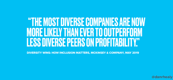
“Addressing privileges is the first step in promoting greater diversity.”
This was further called out during Dan Healy’s talk “On Designing Diverse Teams.” Starting the talk by addressing his privileges made a powerful point on the need for those with privilege to acknowledge and use it in order to create positive change. Tying it back to the concept of psychological safety he lamented “I can use my privilege to do something positive. I can use my position as a senior leader within my organisation to bring about greater diversity inside my immediate team and beyond. I can take risks that others can’t afford to. That’s, in part, down to something called ‘Challenger safety’ [which is] a level of psychological safety.”
Reflecting on changes brought on by the pandemic and recent social movements, Dan reflected “Let’s not make the new normal the old normal. The old normal is a barrier to greater diversity for so many reasons. As Gerry Scullion said in his keynote [Embracing the complexity mindset], in many ways, we’re not adapting to the complexity of the post-covid world. We’re trying to treat the unpredictable as predictable.”
Theme 2: Accessibility and Inclusion
Designing for Accessibility:
The importance of accessibility in design emerged as a recurrent and pressing topic at UX Scotland 2023. Roger Attrill’s enlightening talk, “Colour, Contrast, and Accessibility: Not as Black and White as It Seems,” shed light on the limitations of relying solely on average user experiences. He explored specific elements of accessibility in design. One of the main points highlighted was the flaw of designing for averages and the importance of catering to the diverse range of differences among users.
While striving for inclusive design, designers often rely on various tools to assist and guide them. However, one commonly used tool, the Web Content Accessibility Guidelines (WCAG), is considered outdated and no longer fit for purpose.
WCAG plays a significant role in determining accessibility standards. One crucial guideline from WCAG is that colour should not be the sole means of conveying information. This means that designers need to consider alternative ways to communicate information besides relying solely on colour.
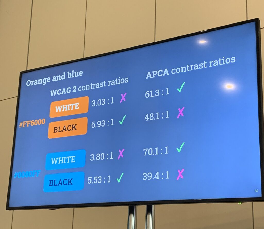
Another key aspect detailed by WCAG is the contrast ratio between text and background colours to ensure accessibility. The contrast limits prescribed by WCAG should not be seen as a target but rather as a bare minimum that should be exceeded.
“Accessibility Guidelines are continuously evolving.”
Colours that currently have a borderline acceptable contrast ratio may face challenges in terms of accessibility in the future. A new tool called APCA, still in beta testing, will be part of WCAG version 3 and is more advanced, taking into account human perception. This tool will lead to changes in what is considered accessible. For example, it may result in a complete reversal of what designers currently consider correct for certain colours, such as certain shades of blue and orange.
Transitioning to a new set of guidelines is a slow process, and it may take years before APCA becomes the norm. Nevertheless, now that we are aware of the standard it sets, it is difficult to ignore it. Designers can consider constraining themselves further and ensuring that their designs align with both the old and new guidelines. Although there is no definitive conclusion on how to cater to everyone’s needs, by designing in black and white and adding colours as enhancements, designers can strive to create more inclusive experiences.
Inclusive Design:
In her talk “Inclusion: going beyond accessibility and digital capability,” Stephanie Krus emphasised that while accessibility is important, it is just one aspect of inclusive design.
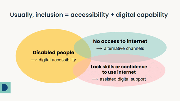
Designers should also consider digital inclusion, capability, and the individual’s identity, which can evolve over time. It is essential to think about all communication channels and ensure that all individuals are aware of the services provided to meet their varying needs. Feedback and learning from individuals with lived experiences are crucial in the design process and post-launch testing. Additionally, barriers can arise for anyone when a task exceeds their capacity, highlighting the importance of considering different users’ abilities and limitations.
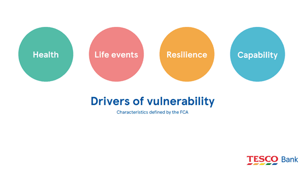
Andy Dykes and Charlotte Cooper from Tesco Bank delved deeper into the topic by sharing their findings on how barriers can prevent people from using services in their talk “Inclusive by Default: creating experiences for everyone.” Designing to prevent harm was emphasised as being more important than focusing on why customers may be vulnerable. Their session served as a great reminder that everyone is vulnerable in some way and has the potential to be excluded from services, if they are not already. One cannot simply guarantee accessibility through accessibility guidelines; it is key to design simply and communicate effectively to ensure that everyone can access the services they need and are aware of what is happening.
This notion of inclusion was explored in a different setting by Mandar Tamhane’s talk on “Running an Inclusive Hybrid Workshop.” Mandar shed light on how traditional workshop formats can unintentionally perpetuate exclusionary practices that hinder access and full participation. Such practices can particularly disadvantage individuals with learning disabilities, visual impairments, or those who require more time to process information. When participants are put on the spot and pressured to collaborate synchronously within tight time constraints, these individuals may struggle significantly.
When it comes to workshops, it’s important to remember that outputs aren’t as important as outcomes.
To address this challenge, it can be useful to share relevant insights and materials with participants before the workshop, providing them with adequate time to reflect and compose their thoughts. This approach shifts the focus from putting individuals on the spot to fostering collaboration and knowledge sharing. Mandar also highlighted a specific example relating to aphantasia, a condition estimated to affect around 3-4% of the population, wherein individuals struggle to form visual imagery. These individuals may encounter additional difficulties with sketching tasks so being aware and making accommodations for activities can help run more inclusive workshops.
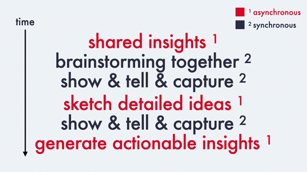
Overall, a key aspect of successful workshop facilitation is understanding the audience and engaging with them beforehand to identify necessary accommodations. By adopting inclusive practices, facilitators can create an environment that respects individual differences, allows everyone to contribute meaningfully, and ensures that diverse perspectives are valued and heard.
Theme 3: AI, Mixed Realities, and the Future of UX
Navigating Challenges in AI and What it Means for UX:
Sunny Stueve captivated the audience with her insightful and participatory talk “Artificial Intelligence: Impact on UX.” She began by highlighting that AI has been a part of our lives for much longer than we realise. From Alexa to chatbot support to navigating traffic through Google Maps, AI is already prevalent in our day-to-day activities. While recent years have witnessed unprecedented advancements in AI, driven by access to vast data sets, it’s important to note that significant AI booms also occurred in the 1950s, 1980s, and 1990s as well.
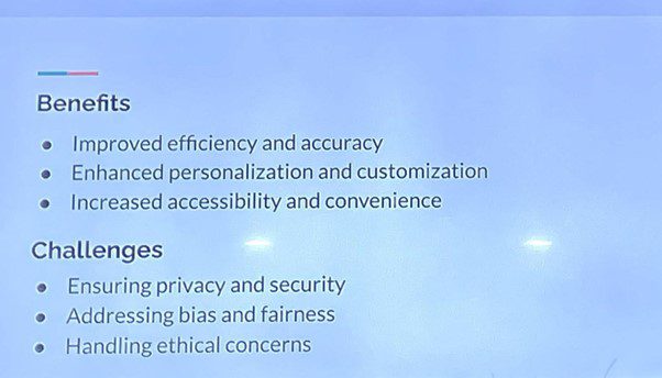
During the discussion, Sunny delved into the challenges and potential threats posed by AI. She emphasised the criticality of ensuring fair and unbiased data and protecting it from potential data poisoning. As one of very few dedicated User Experience Leads for Artificial Intelligence, she addressed the common fear shared by many in the room: the fear that AI will replace jobs in the future. Sunny reassured the audience that, due to the human-centric nature of User Experience, human contribution will always be necessary. UX professionals possess an intimate understanding of customer patterns, preferences, and nuances, which is something that AI cannot replicate. On the contrary, AI has the potential to enhance the work of UX professionals by automating time-consuming tasks such as transcribing research and sifting through forms.
“We can use AI to streamline but we need humans to validate.”
As the discussion continued, participants in the room shared their views on how AI can also help in avoiding human errors. However, it was acknowledged that AI is capable of making errors in different ways. Sunny emphasised the importance of semi-automated systems in UX, where AI can complement human work and vice versa, allowing for a more comprehensive and accurate approach.
Sunny also touched upon the importance of regulation in the field of AI. Interestingly, since the talk, Prime Minister Rishi Sunak announced on the 12th of June that Britain could become the global hub for artificial intelligence. Notable organisations such as Google DeepMind, OpenAI, and Anthropic have agreed to share their AI models with the U.K. government for research and safety purposes, underscoring the collaborative effort in advancing AI technology responsibly.
The Rise of Mixed Realities:
Another hot topic in the tech world lately has been the recent launch of Apple Vision Pro – an upcoming mixed-reality headset. As such, it was very interesting to be able to attend Matt Corall’s talk discussing “How to design the interfaces of the future with hands & gestures” to learn more about the details of design. The emergence of mixed realities (MR), including augmented reality (AR) and virtual reality (VR), will bring new dimensions to the future of UX design.
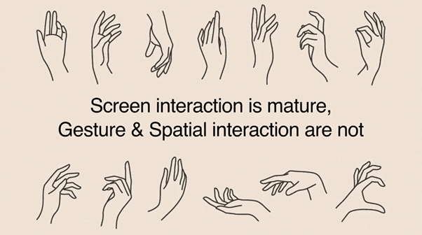
It was clear to see there are many challenges ahead for UX design for these emerging technologies. The absence of a standardised design for buttons or interaction menus can complicate the design process for UX designers in the realm of mixed reality. Unlike the established design standards for desktop, mobile, or tablet interfaces, the advancements in AR/VR/MR technologies present a wider challenge, as these standards are yet to be defined.
“Considering cultural barriers and sensitivities becomes crucial when designing for global audiences.”
Another challenge discussed was the cultural influence of gestures on the use of touchless display screens. Different cultures have distinct hand movements and postures, which can affect how users interact with the technology. For instance, the Asian stance often involves covered hands, while Italians tend to use more hand gestures in their communication – these can both create various challenges for the technology involved.
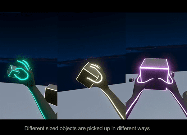
Teaching users to navigate and interact within mixed reality experiences also poses a significant challenge. Users need to learn prompts and instructions, and designers must provide effective tutorials and onboarding experiences to ensure a smooth learning curve and adoption of the technology.
The advent of mixed reality technologies presents exciting opportunities and challenges for UX designers. Designing interfaces for mixed realities requires navigating through the absence of established standards, accommodating natural variances in gestures, considering cultural differences, and providing effective user education. The goal is to create immersive and intuitive experiences that seamlessly integrate with the real world while meeting the diverse needs of users.
Conclusion:
UX Scotland 2023 was a transformative event that delved into the intricacies of UX design, fostering a deeper understanding of the challenges and opportunities within the field. By nurturing communities, driving inclusion, and embracing the future of UX, professionals can collectively shape a more equitable, accessible, and user-centred digital landscape. The conference served as a reminder of the importance of ethical practices, building psychological safety, designing for accessibility, and embracing emerging technologies responsibly. As the UX community continues to push boundaries and challenge existing norms, they pave the way for a future where user experiences are truly inclusive and empowering for all.
A massive thank you to all the amazing speakers and facilitators, as well as the team at Software Acumen for bringing this event to life. As we continue to digest and reflect on how this information can better our work, we’re already looking forward to the next one!