Getting the chance to attend another UX Scotland, I was very excited to see what this year had in store.
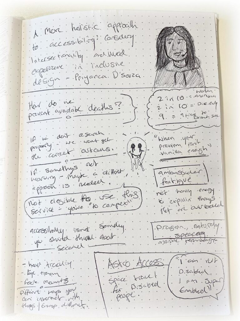
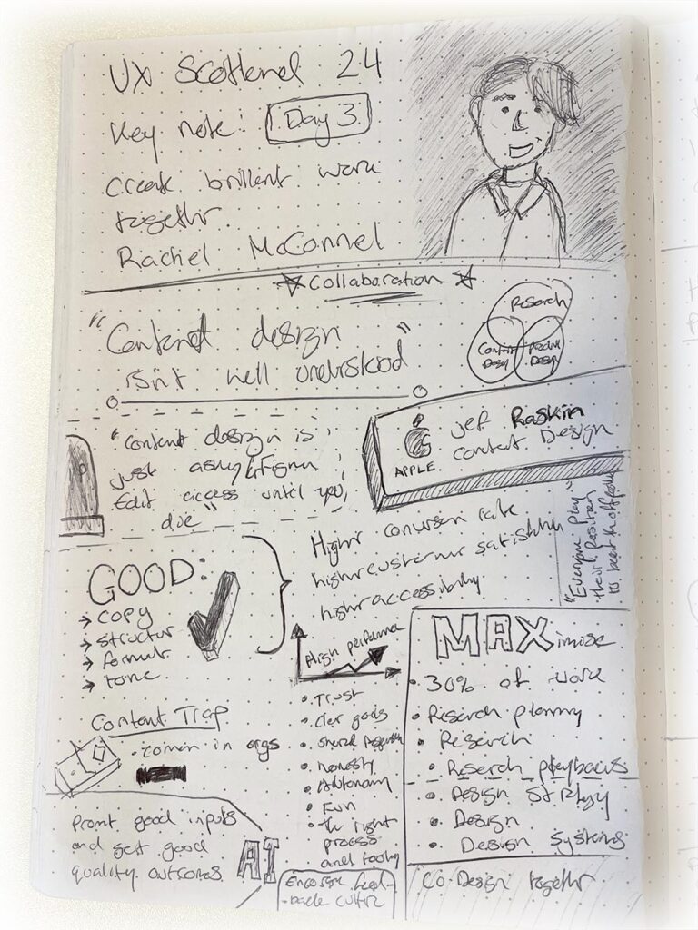
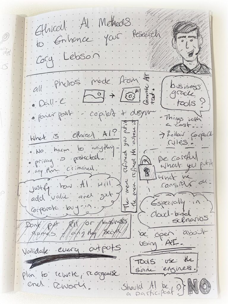
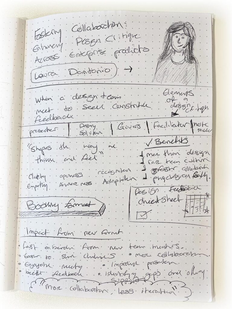
Once again I got to meet lots of new people working in the user experience industry. As well as meeting new people, I was also able to catch up with people that I’d met last year. It was great to hear what everyone had been up to, what cool projects they’d been working on, and what they have coming up. And as there were so many interesting talks and workshops to attend, this was also a great opportunity to put some sketchnoting to the test.
After some reflection, here’s my key takeaways and sketchnotes from my three days at UX Scotland 2024.

What is sketchnoting?
I recently read a book called; ‘The Sketchnote Handbook – The Illustrated Guide to Visual Note Taking’ by Mike Rohde. So, I knew UX Scotland would be the perfect place to practice the methods I’d learned.
‘The Sketchnote Handbook’ is an illustrated book that teaches you about the methods of sketch notes and how you can use them to capture creative looking notes from talks and presentations through the use of drawings, sketches and thoughts.
As a visual learner it’s a very fun process to use. The great thing about sketchnoting is, regardless of your drawing skills. It is something that helps your brain work that little bit more and helps retain subtle bits of information that can be really useful for your notes. Its all about capturing the moment and what your brain is processing and thinking at the time.
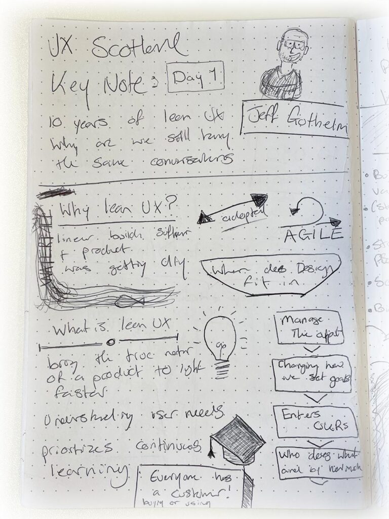
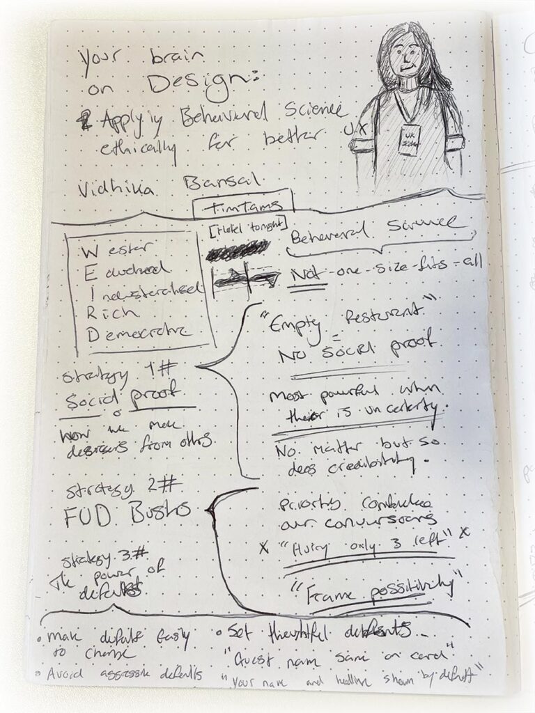
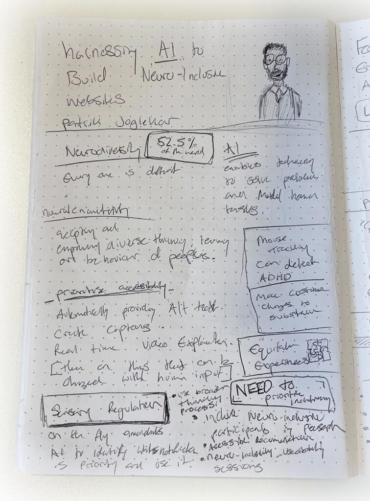
One section of the book I benefited from was the part around your initial page setup. This consists of creating a cover for your sketchnote. It will typically have, the talk or presentation title, the name of the presenter(s) as well as a doodle of the presenter(s). This initially helps you get in the creative and sketching mood before the talk begins. One huge benefit of this method is that when looking back at your notes, and being visually reminded of the speaker(s) can trigger your brain to remember more information that you consumed on the day.
What I enjoyed about sketchnoting, was being able to see the way my brain and thought process were working throughout the talk and being able to visually see the information that I was consuming. I would make sure to maximise the space within the page and scatter different ideas or key points mentioned in different areas. This could be links to examples or little notes to reference from. It is really fascinating to look back at them, as some people may never be able to look at them and understand what’s going on. But, when I look through them, I can see how my brain was functioning and almost relive the talk when reading through them.
My takeaways from UX Scotland 2024
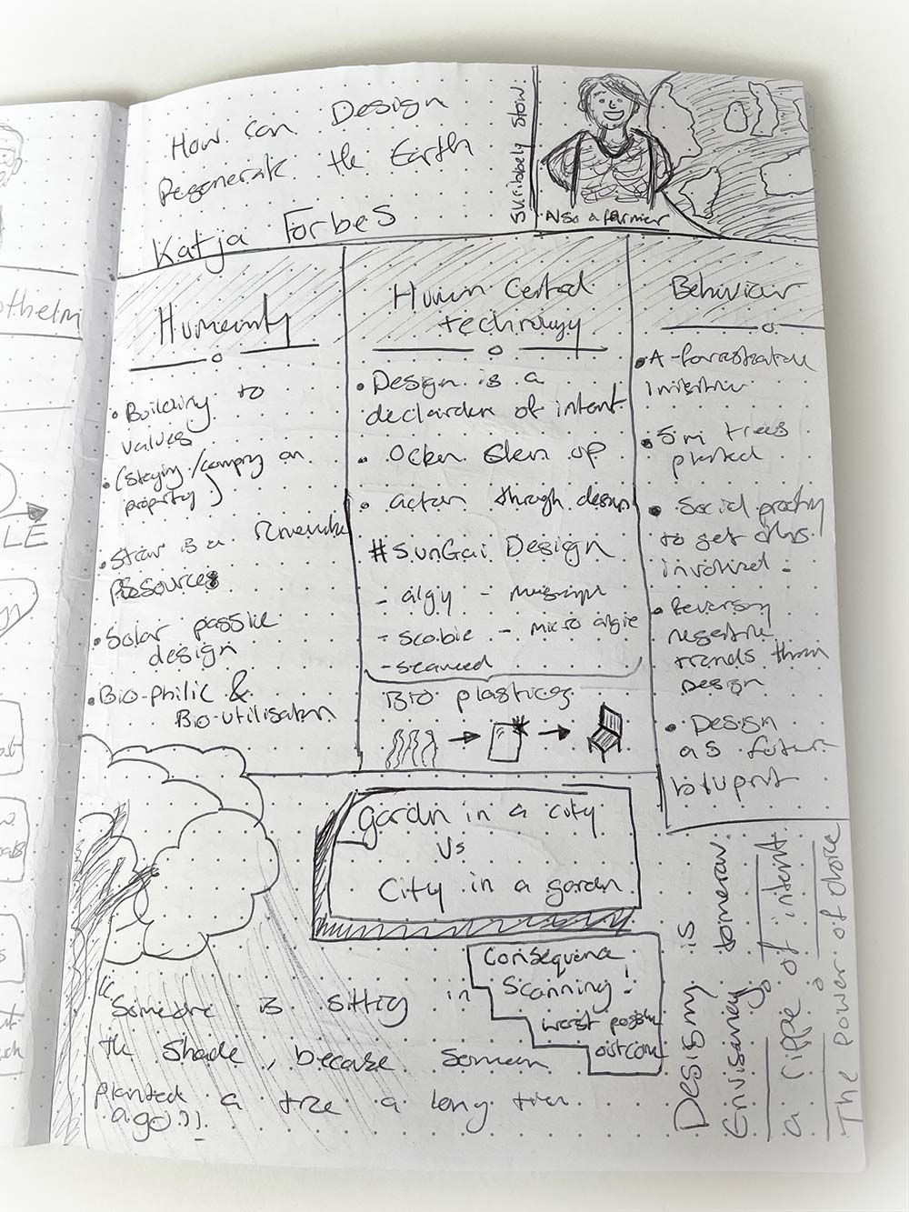
I attended some really great talks, and one of them I attended was ‘How can Design Regenerate the Earth’ by Katja Forbes.
This presentation was super fascinating and was a great eye opener when it comes to the idea of designing with purpose, as well as thinking about impact our work has to the future of our planet.
My biggest takeaway from this talk is the extra consideration that I am going to have when it comes to my design work. Taking the time to think and evaluate how the work is going to impact not just people, but the world.
Is it long lasting? Is it timeless? What’s the most efficient and sustainable way to go about this? What is done with it when the project is finished with? Can this be re-used in years to come?
A really great quote that was mentioned by Katja during her presentation was;
“Someone is sitting in the shade, because someone planted a tree a long time ago.”
I found this quote very inspiring, as it made me think about what I can do in my work that will impact others in the future.
Katja also showed us the design of her house, a straw-bale home that was built with everything efficient and sustainable you could imagine. The materials used and layout of the way the house was built allows it to stay at 22°C all year round. Staying cool in the hotter months as well as stay warm during the frosty ones that can reach sub-zero temperatures.
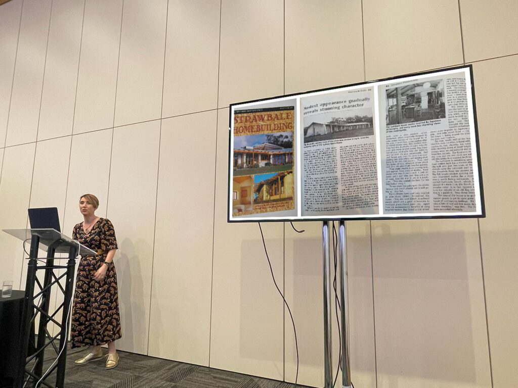
The materials that were used to build the house are all recycled, and allow the house to be biodegradable, meaning if the house were to be knocked down, the only thing that would be left of it after some time, would be the foundation slabs that it sits on. I found that fact very fascinating and was totally mind blown that techniques and processes like this were possible. This then further led into the discussion of bio-plastic materials and how they are being investigated, tested and being used and what the future holds for them.
This talk has definitely inspired me to think more about what design can do to make a difference for our world and got me excited to research more about what is possible to help make things more sustainable, re-useable and overall have a purpose.
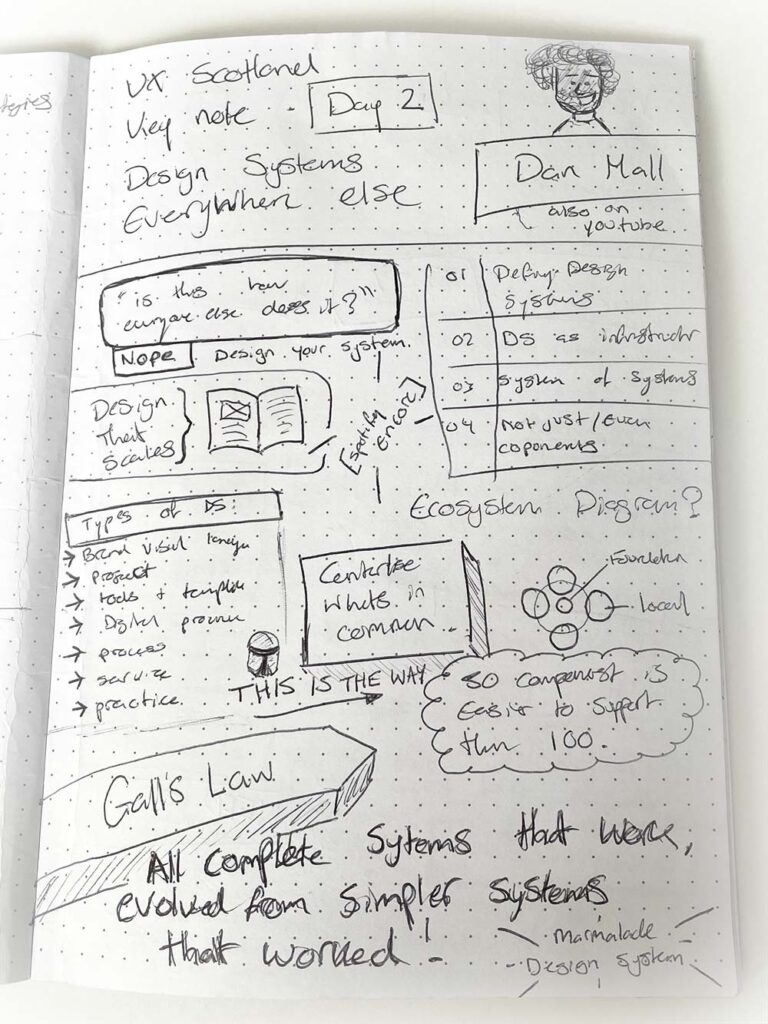
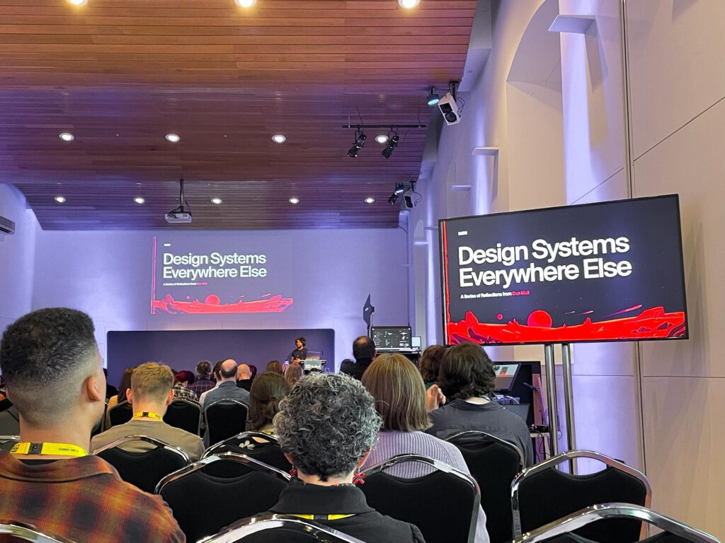
The next talk that I thoroughly enjoyed was the Keynote talk ‘Design Systems Everywhere Else’ Presented by Dan Mall.
This keynote was definitely something that was relatable with some of the work I have been working on at the moment. Since working with the team on our design system it was a great to hear about common practices and what types of design systems there are. Especially the part where Dan talked about, finding what the purpose of the design system is and why it is key to know this.
I recently published an article that goes through my experience so far and the progress of working and developing a design system with our team, this post is called – ‘Developing a truly collaborative and responsive design system in Figma’.
There were definitely lots that I took away from this keynote that will help me when it comes to working within design systems.
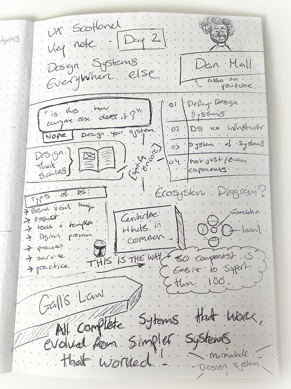
The topic of a ‘System of systems’ was something that I hadn’t heard about and found very interesting. It would be something I would love to experiment with and try. The thought of companies having separate libraries and assets such as icon use cases for different departments was something that didn’t cross my mind. So, learning about ‘System of systems’ was something I will definitely take away and keep in mind for the future.
One great point that was raised by Dan was talking about supporting and managing your systems.
“50 components are easier to support than 100” and “Centralise what’s in common”.
These comments made me realise that a design system doesn’t need to be a gigantic, never ending list of thousands of components and elements. The idea is to make it work and have it work well. It allows it to adjust over time and be more digestible to manage and easier to work with for others.
If it needs to grow, it will present itself with the room to evolve. This was on the subject of Gall’s Law;
“All complete systems that work, evolved from simpler systems that worked.”
My main takeaway from this talk is to make simple work, and then make simple work better.
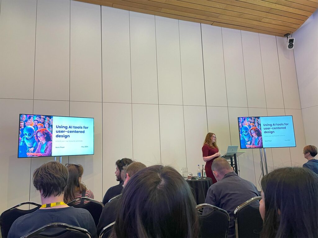
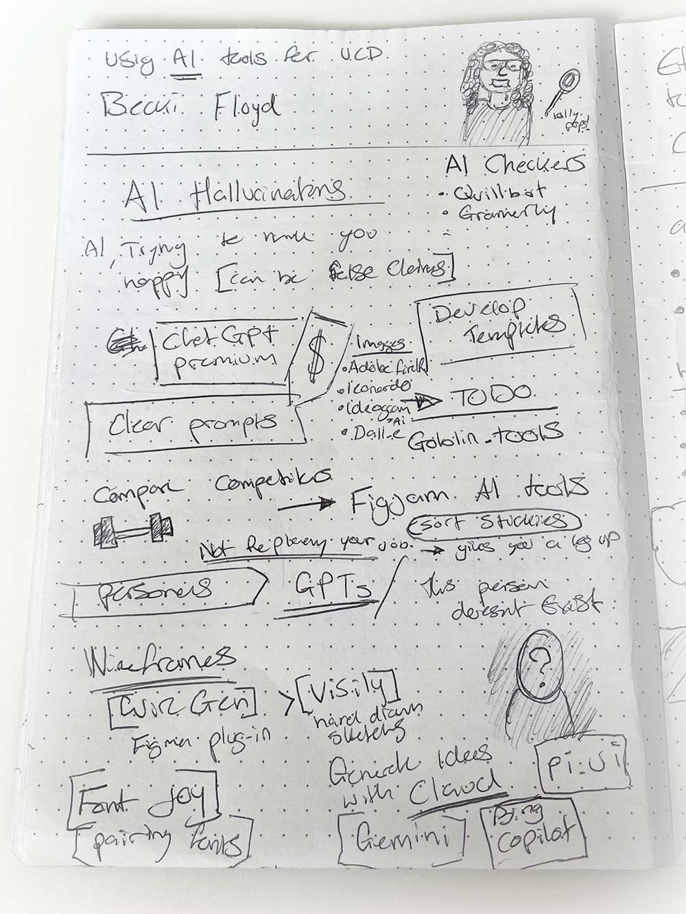
‘Using AI tools for User Centred Design by’ Becki Floyd was a very interesting talk, as it took the approach of showcasing AI and different tools in a demonstration setting.
The subjects from the talk were generated there and then by AI and allowed us to see how it holds up in a real scenario instead of seeing perfect results.
I hadn’t been 100% confident in Artificial Intelligence tools that have been rising to the surface recently, as it felt like there was so many possibilities and things that are still being worked on. This meant I never knew where to really start.
However, Becki told us the things to look out for when you are getting into using AI, one example being AI Hallucinations. This is where AI is trying to predict your answer from data that it hasn’t gathered yet. The answers that the AI end up providing you may be incorrect or misleading. It was discussed how important it is to check the AI’s sources and see where information has been taken from before using it within your research or workings.
Becki’s presentation showed us examples of a palatable set of AI tools that could be used for great efficiency, especially for beginners in the world of AI like myself.
She showed the importance of using good prompts and showcasing – the better the prompt the better outcome we will receive.
There were lots of tools shown for different areas of user centred design. Some of these I will definitely be investigating and seeing how I can possibly incorporate it into my work.
Some of these tools include;
This person doesn’t exist – a tool that uses AI to produce an image headshot of someone who doesn’t exist in the real world. A tool like this will be extremely useful when creating personas.
WireGen – this Figma plugin tool allows you to create digital wireframes from created sketches you have drawn as well as add or adapt it with prompts.
FontJoy – this site, uses AI to pair fonts in a matter of clicks, allowing you to see what fonts work well together and what use case you want them for. If you want them visually similar or contrasting as well as being able to generate random pairings.
GoblinTools – this website allows you to create simple to-do lists with the help of AI. You can simply insert a task that you need to do, and AI will work its magic to break down that task into a separate list of subtasks you may need tick off to finish a task. The tool also allows you to change the “spiciness level” of how much breaking down of your task it will do. As someone who loves a check list this is definitely a super cool tool to try out.
Becki’s talk allowed me to take away the knowledge that AI doesn’t always have to be something overwhelming. There are AI tools out there that are made to do simple tasks, well. The tools Becki showed us are ones that are useful and help give you a leg up in your workflow.
Overall, my three days at UX Scotland 2024 was great. I managed to takeaway a lot of knowledge and new things to try. Getting to network and meet lots of new people people as well as making new connections was lovely.
Thank you to all the speakers, keynotes and people behind the scenes as well as Dynamic Earth and the Software Acumen team for a great conference!
Want to check out more sketchnotes
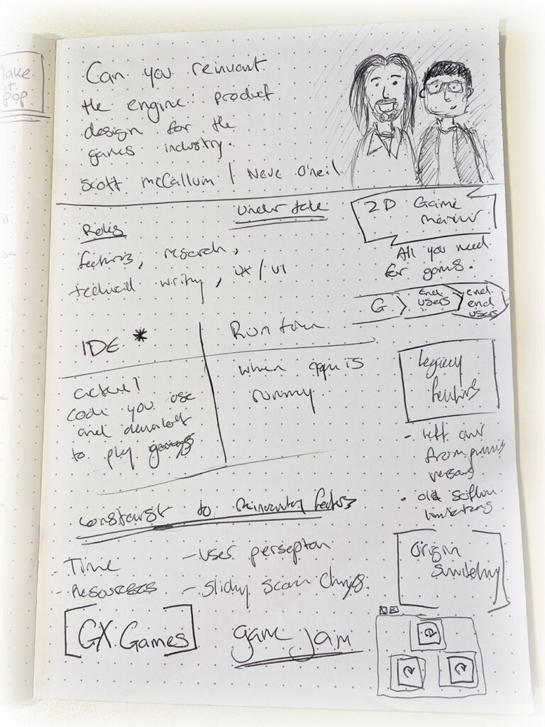
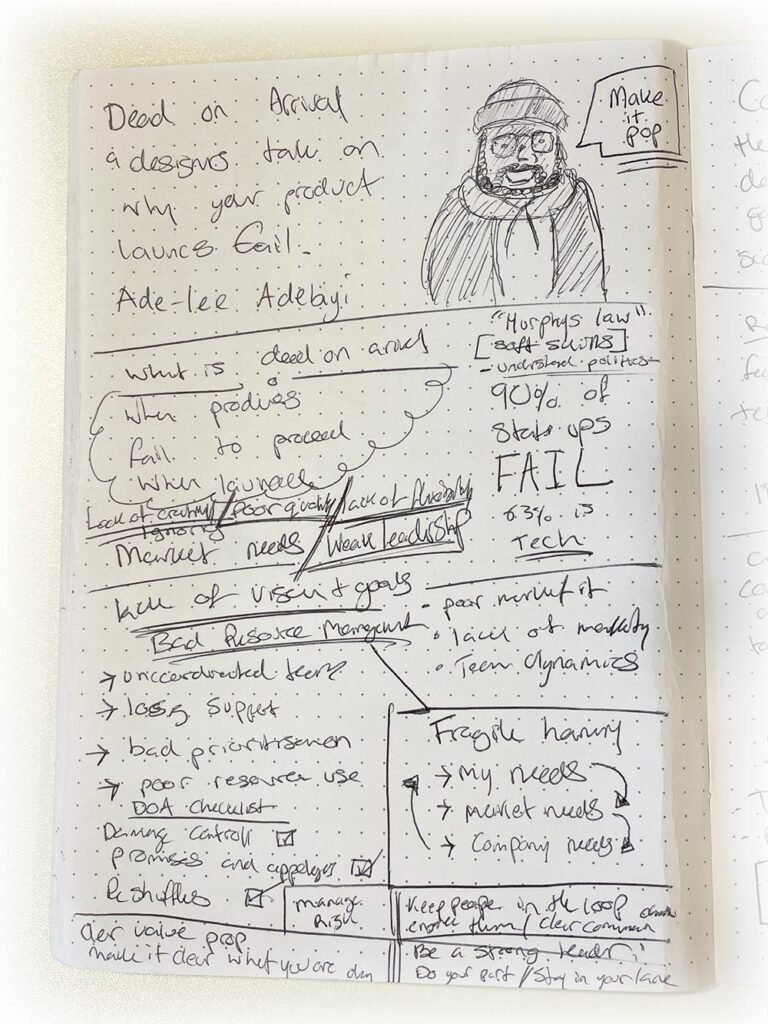
Here are some more of the sketchnotes I created throughout UX Scotland:
