Improving your life as a user experience designer
Experimenting with new tools is something that user experience practitioners regularly do. But sometimes they just don’t seem to hit the mark. Sometimes this is because we do a quick test but don’t go deep enough to see how things truly perform. Sometimes it’s because we test things at the wrong time. Software changes rapidly and if you don’t keep an eye on things you may miss key improvements that could change your opinion.
Recently, I’ve learned that giving tools a second chance, could be key to making your life in user experience more efficient and effective. We focus our time trying to improve people’s experiences. So, why don’t we find some extra time to give tools a second chance if they could improve our experiences as designers?
Personally, I am a huge Adobe fan. I have used their Creative Suite for 10 years have spent many hours gaining a deep understanding of Creative Cloud. I can produce the work I need to do in my role, incredibly quickly and efficiently whilst maintaining high quality standards. So, my question was always “why would I need anything else?”
My first encounter with Figma
At college, Figma started making its way on to the scene. As a free tool that allows you to design and prototype in a collaborative space, I understood why there would be some excitement around it.
I do what we all do when something new rises to the surface. I dive in and start to play around with its functions and learn the constraints of the tool. I quickly came to the conclusion, “I can achieve this within Adobe XD…” and continuing to use Adobe XD would mean I could keep all my files and assets compiled together in one space within my Creative Cloud. In truth, I didn’t think it would stay popular for long. So, I closed the door on it and decided to stick with my preference and continued being an Adobe user.
But software moves fast and it doesn’t take long to improve things if you listen to your users. Figma has rapidly become an industry standard tool that people use all over the world by responding to what their users need. This made me want to take another look at Figma as I wanted to see what I was missing out on. So the next time a relevant project came up I was keen to dive back into Figma and see what it enabled me to do from a prototyping perspective.
Why prototyping is beneficial
Creating prototypes is a hugely beneficial activity. It allows you to deliver an idea and experience of how a product could turn out before a lot of time and money is invested in creating a final output.
Prototypes can be as simple as sketches on a piece of paper that showcase the user’s journey, to a hi-fidelity clickable prototype that gives the impression of a real interface.
It’s best practice for a series of low-fidelity wireframes to be created and iterated on first before jumping into hi-fidelity development. As this helps you define and refine your requirements before you start applying visual design.
Once wireframes are created, a decision is made in regard to the fidelity of the prototype.
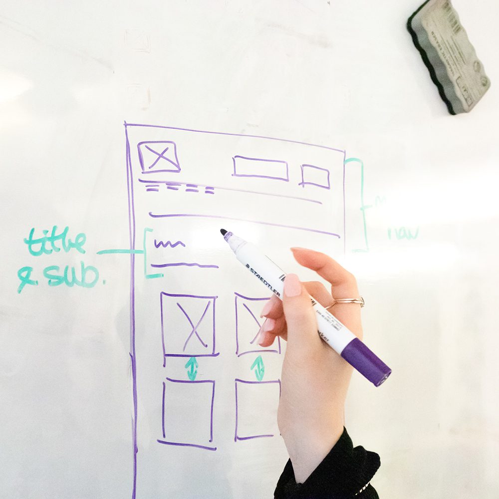
Low fidelity prototypes
Low-fidelity prototypes are simple concepts, commonly created with pen and paper, which have the artefacts and elements you need to piece the prototype together. These can be used to develop ideas quickly and can be created by anyone.
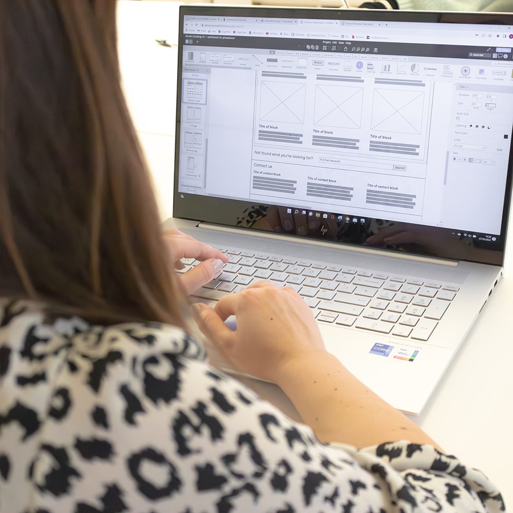
High fidelity prototypes
High-fidelity prototypes are a highly functional, interactive prototype that is representative of what the final product could look like. They usually have different journeys, and an underlying design system that contains developed components that are then re-used within the prototype.
Where prototyping comes in
My passion for user experience came from the satisfaction I gain from improving and making people’s lives that little bit easier. Whether it’s making a task easier for to get through, easier to understand or helping people save time.
My main focus in user experience is within visual design.
Now of course I can change the colour of a box to blue, however what I do in my role is – design the thinking behind creating something. That could be designing something that could allow anyone to change the colour of a box to blue, purple or anything else they want, even a square.
The simplest way of putting it is – I do the thinking, so others don’t need to.
I have created many different prototypes using Adobe XD as well as building design systems that help iterate global colour or font changes within the designs. However, I have never quite been able to make it simple for others to come along and make major changes without there being an impact on the prototype.
When I had the chance to investigate Figma again, I caught up with the latest features and what was capable within the tool. Doing this reiterated the importance of re-visiting software. As my design thinking mind couldn’t stop imagining Figma’s prototyping potential.
Developing a responsive design system
My learning made me ask myself the question – Could I create a fully functioning and responsive design system component library that makes use of variables and tokens? As this would allow anyone to create drag and drop prototypes journeys quickly and efficiently.
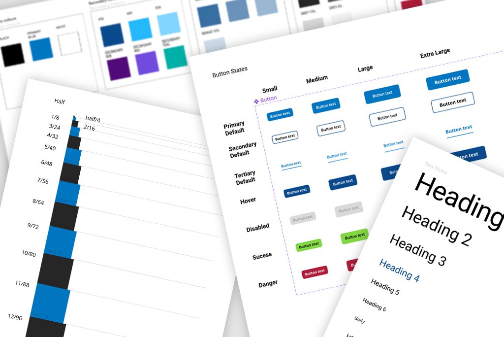
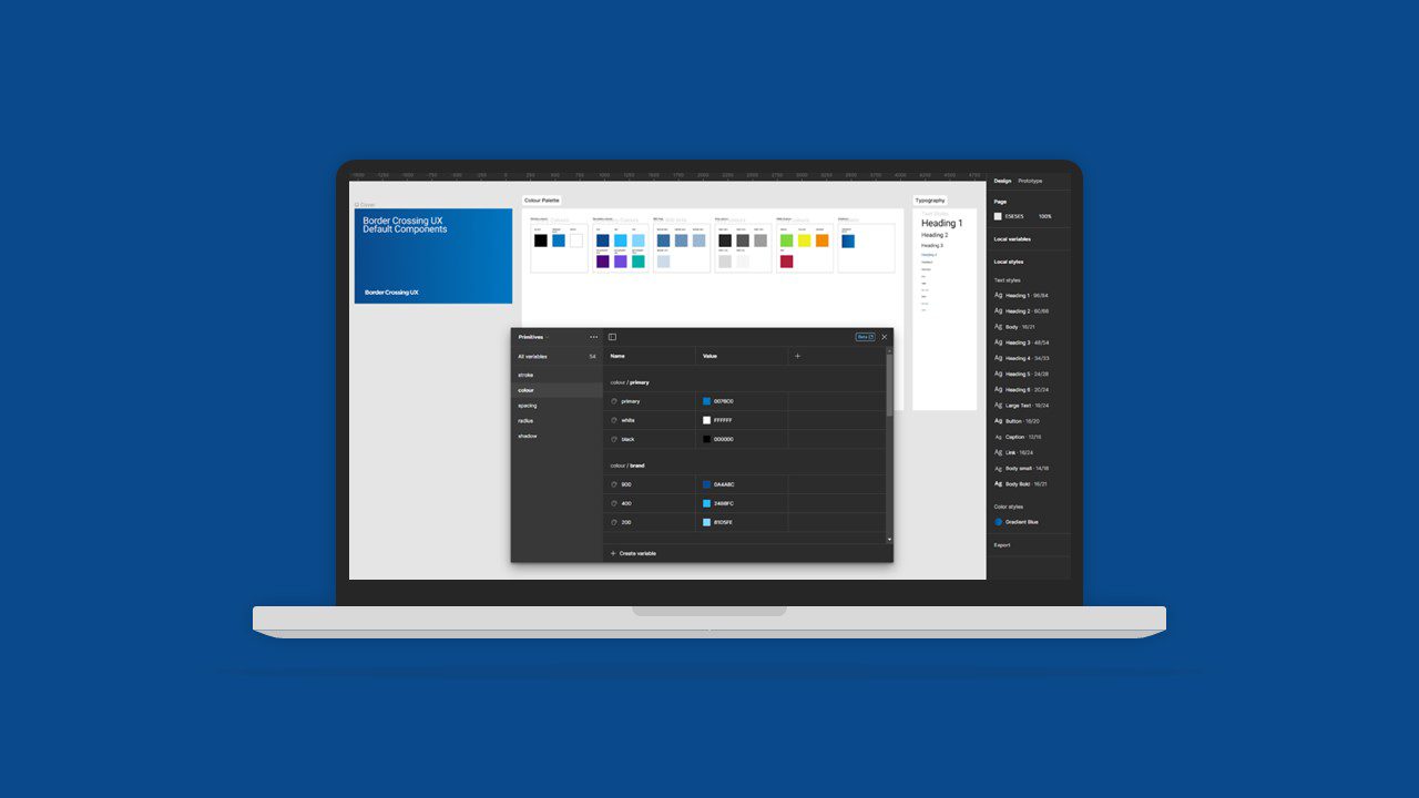
To ensure this was a valid test, we would build a full library of components and elements, with different variables, states, and accessibility modes. Allowing us to have components for any occasion. And providing us with the ability to change the token properties to suit any brand, tweaking the colours, fonts, guidelines, and styles, that globally change in a flash throughout the whole project.
Figma variables and tokens are a plug-in for property settings, which allows you to create default values for different types of properties. This could be the spacing between elements or even the width of a stroke. Allowing you to make global changes to component properties throughout your whole prototype that make use of these values.
Our goal was to set up this library, so we could simply swap properties to relate to guidelines of a brand. If a brand required, all their buttons to have rounded corners. You would simply change the button radius token to the value needed, which would then update globally throughout the whole prototype in seconds.
This enabled us to have a system that allowed anyone to drag and drop components and build up prototype screens, without the worry of aligning or spacing between objects.
Setting up
We started by creating a new project workspace and inserting colour palettes, text styles and then building our primitive properties.
These properties held colours, stroke sizes, spacing, shadows and radius sizes.
With all these settings applied, we then started to think about what components were needed to help us create token variables that were built into the components.
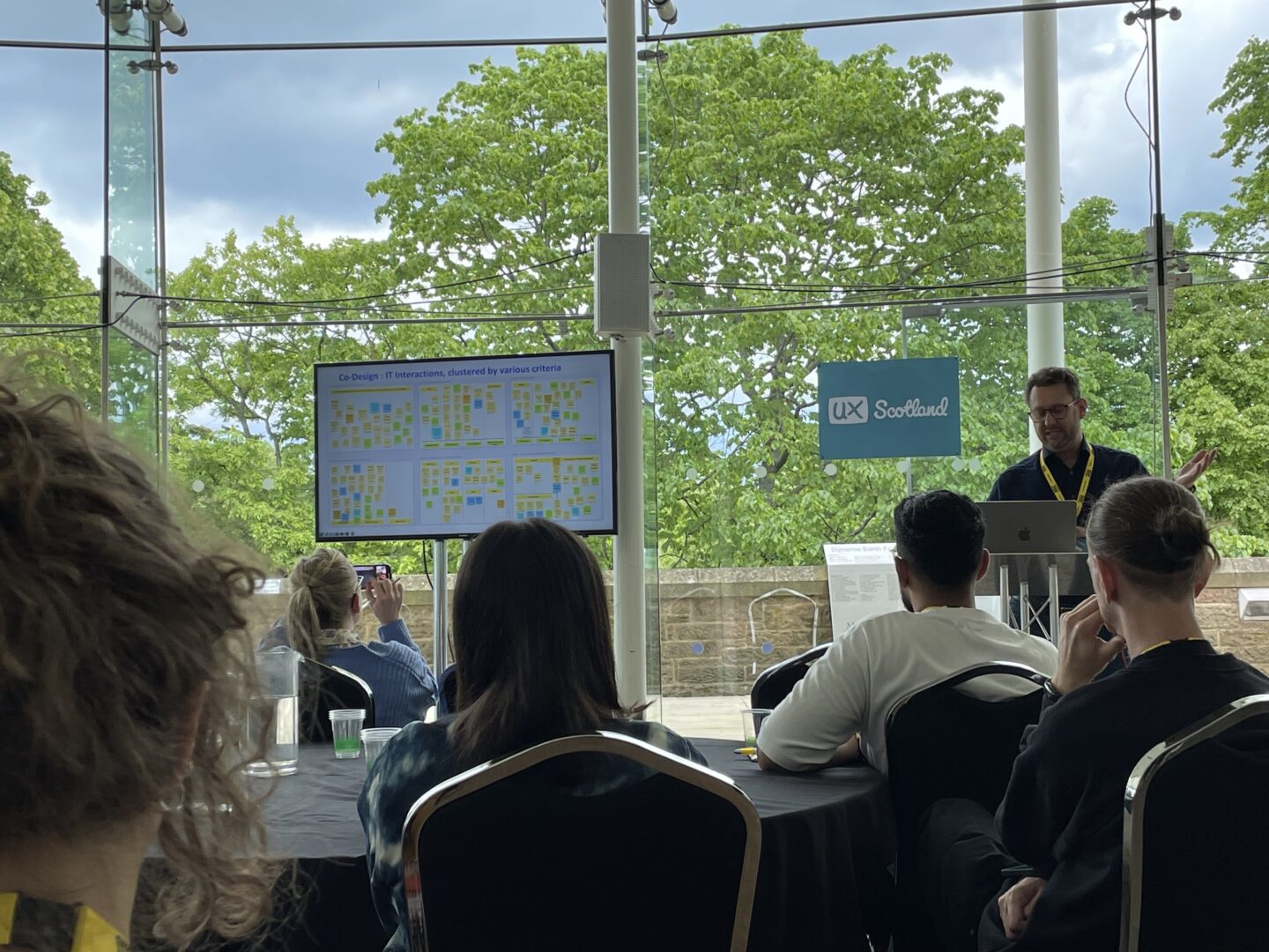
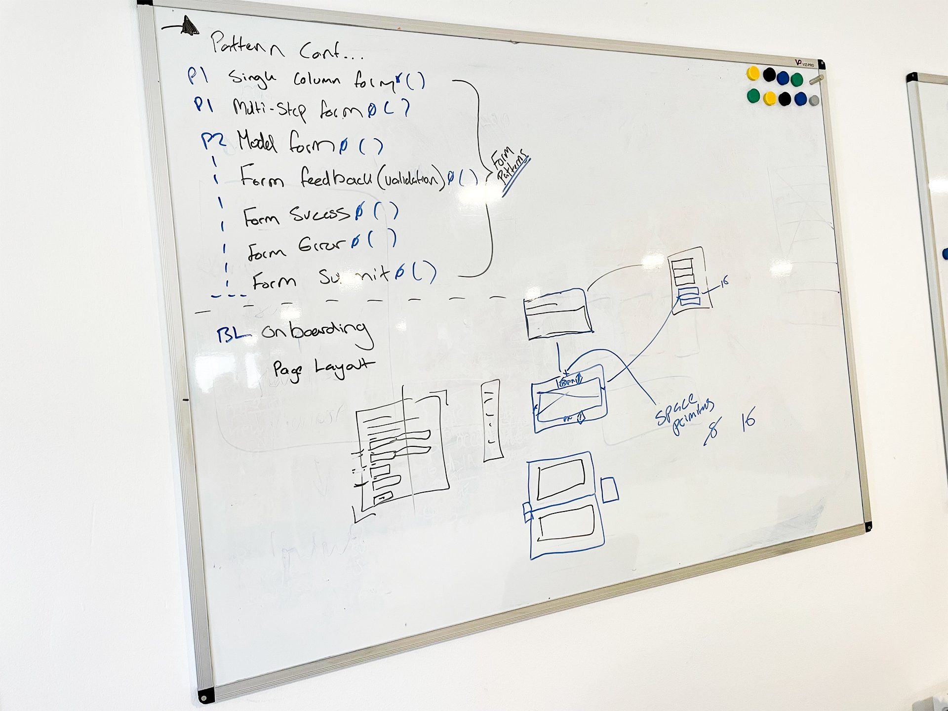
Our discussion was conducted on whiteboards. This allowed us to create lists of what elements we wanted to achieve, as well as put time estimates and priority values beside each one. Whiteboards were effective for this task when it came to sketching out how we wanted components to behave and react across viewports.
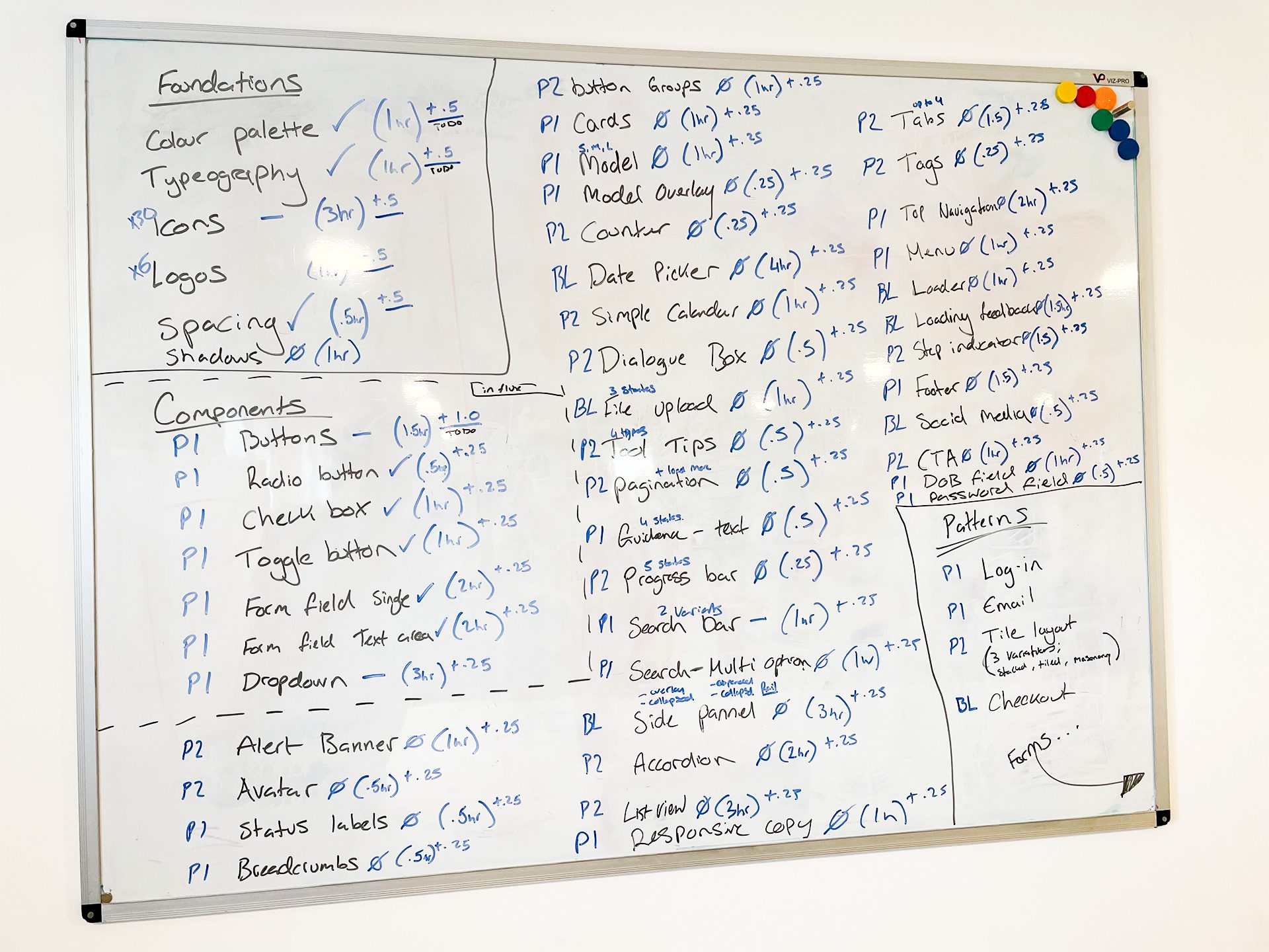
We then input these lists into our project management system with notes and updates for each asset.
In no time at all, we managed to start producing a good number of components and build our library so we could test if the goal we set out to achieve was possible.
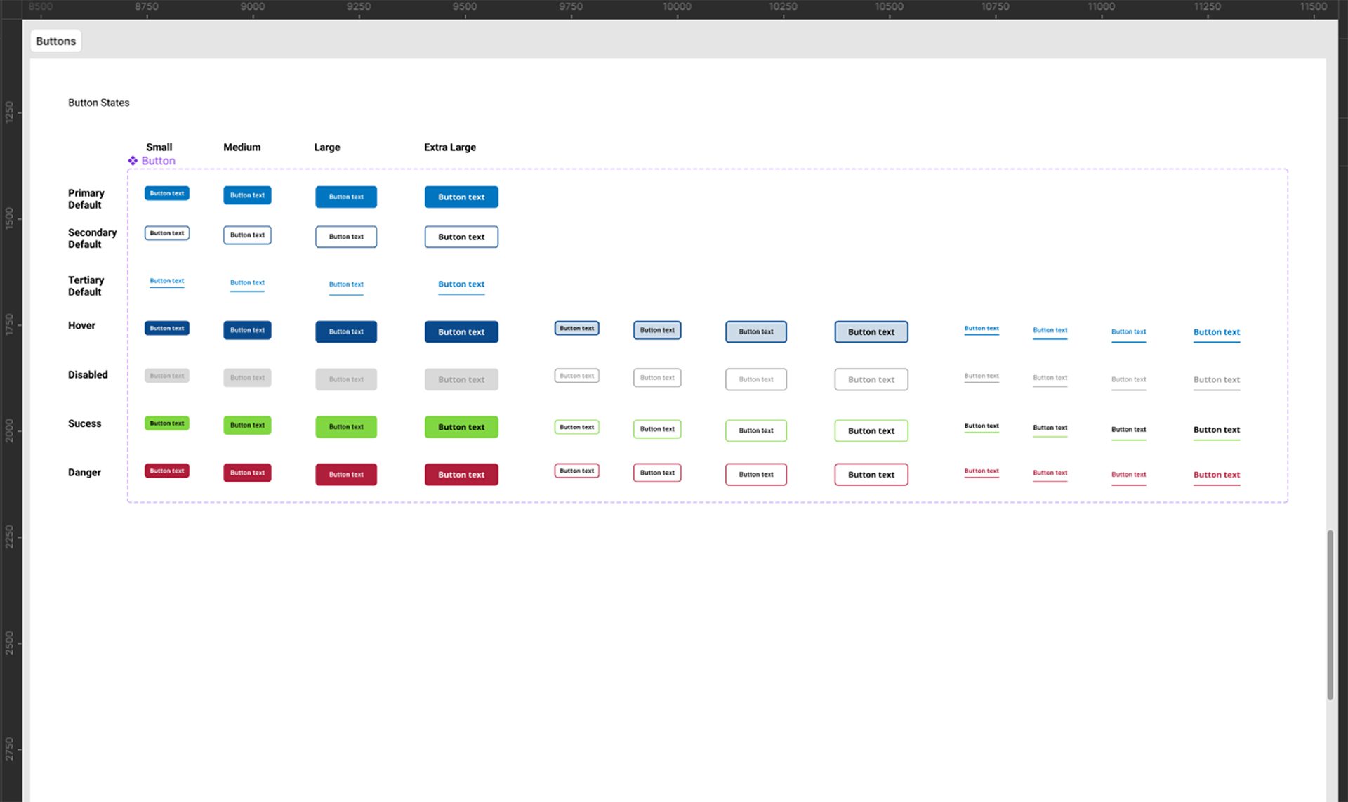
We created our components in a vanilla style, to help make it easy for styles to be implemented and adapted to the relevant brand guidelines.
With our buttons set up this way, it allows us to have a button for any occasion. With there being over 180+ possible variants for a single button.
In our button component, we’ve enabled these options to be controllable;
- Size – small, medium, large
- Type – primary, secondary, tertiary
- State – default, hover, disabled, etc…
- Show icon – can be applied to the right or left of the button
- Icon – allows you to swap the icon from a list of gathered icons within the library
- Show focus state – ads a focus border around the clickable area that would appear when tabbing
- Show text – allowing you to hide the text if you only wanted an icon button
These options allow you to create any sort of button that you may need. This approach was applied across components. And soon we had enough components to start testing.
Initial testing
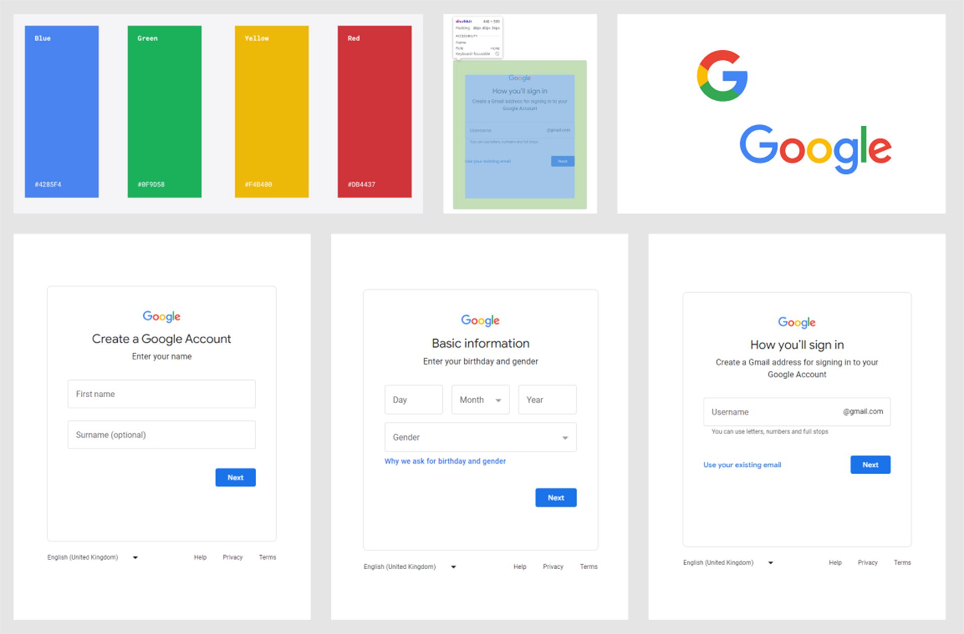
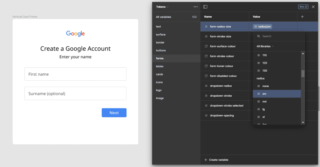
The first test we investigated was, seeing if we could simply re-create a form that is already made and used within the real world.
After gathering a few example images of the Google Account creation process, we inspected these using Chrome Developer Tools to identify all fonts, colours and margin sizes used.
We screen recorded the process of re-creating this form, allowing us to catch any issues or struggles that we ran into. That way we could find solutions to make it more efficient and easier.
With the components we had made. We were able to quickly block out the elements that were needed, such as; logo, title and text, form and buttons.
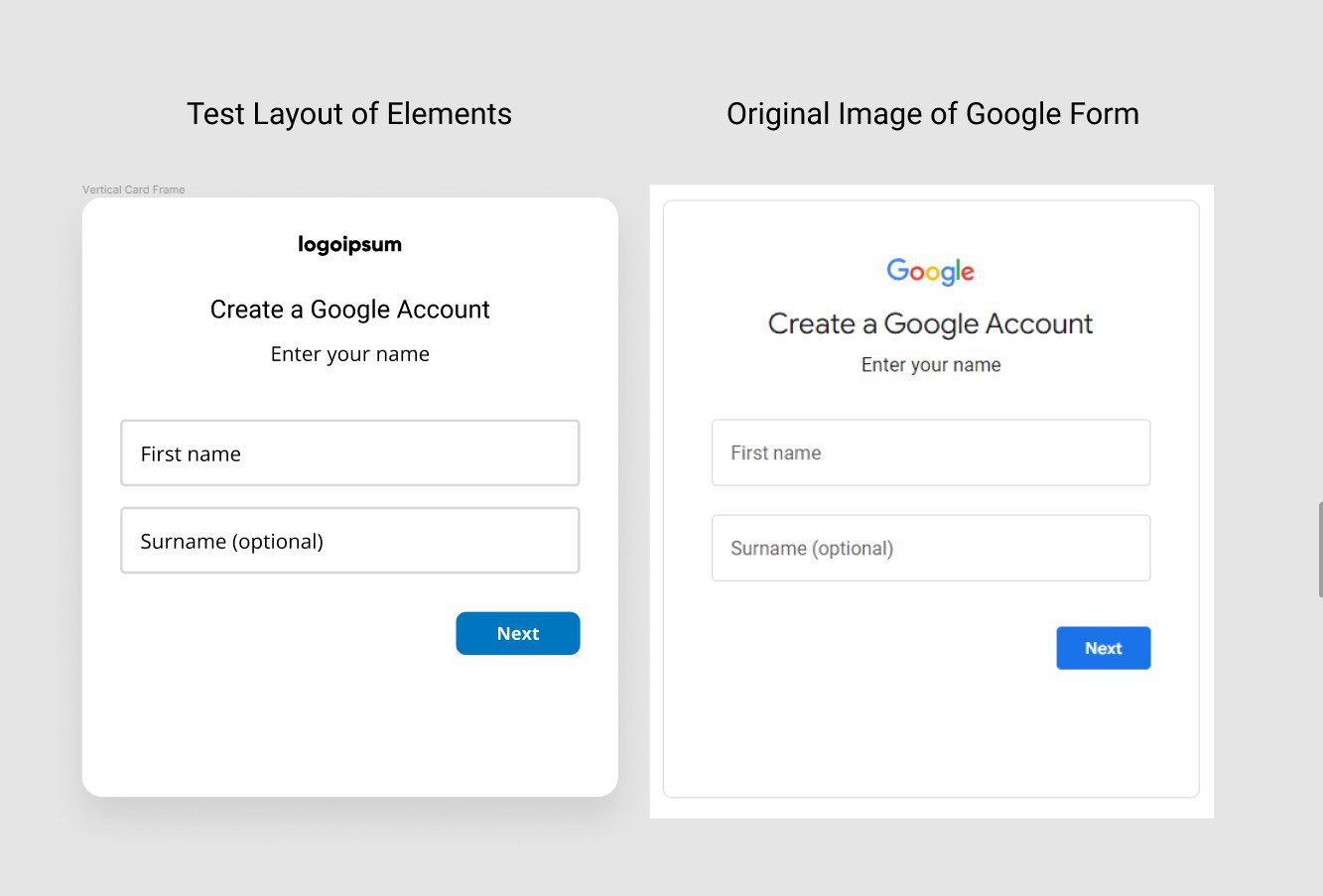
After mapping out this draft layout. We could then quickly start adjusting the token properties to start incorporating the brand colours and styles into the design and making it appear more like the forms we were trying to re-create.
Very quickly we were achieving the results that we wanted to see. We now had a design system set up to create prototypes that enabled us to create on brand Google assets.
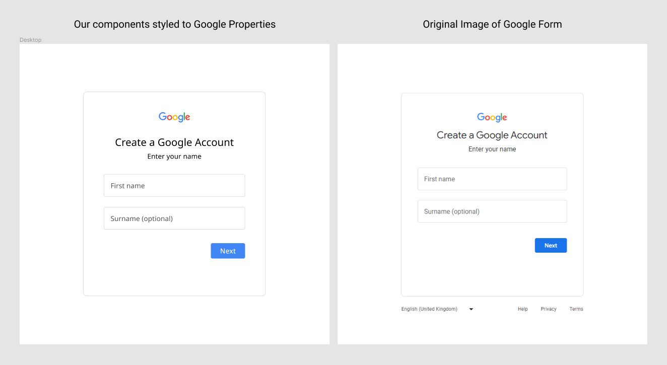
Doing a test like this was beneficial to see if the plan we had for creating a responsive and fully customisable prototyping library was on track.
There were of course some speed bumps that occurred during the first test, but we weren’t expecting perfection first time round. Having it recorded was the perfect way to watch back and see what was needed to help make elements work as intended.
Some of the errors that we encountered in our first test were:
Logo scaling issues
We had an idea of creating a responsive logo component that would allow us to swap out logos for any brand identity so that it updates wherever it’s used in the library. Whether it’s in the footer, header or even a favicon.
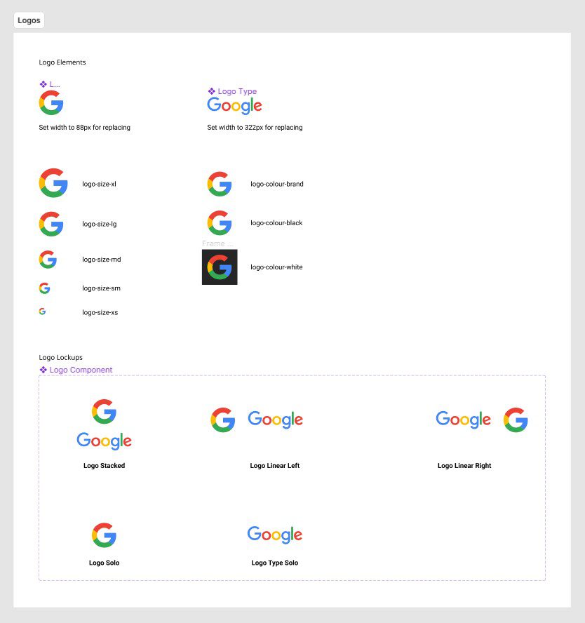
After setting this up, the test showed us that we were having an issue scaling the logo to the size we desired within our design. A quick fix of making sure auto-layouts were being used correctly allowed us to fix this scaling issue.
Icon changing issue
We had instances set up so that you could change icons within buttons and fields. However, we came across an issue when we changed the icon, it wouldn’t maintain the original colour or size settings.
It was discovered that the layer naming conventions within the icon components had to be set up exactly the same way for every icon. After making this change it would maintain the correct properties and worked how we intended it to.
Mobile interaction prototype issue
Within our components, we have also implemented interaction patterns, for example the buttons have a hover state when a mouse hovers or clicks on the component. However, when we were testing things on mobile, we noticed that our interactive states weren’t working. After some trial and error, we worked out this was happening because we had an issue between default, click and hover states across viewports. This was resolved by having a distinct approach for each viewport.
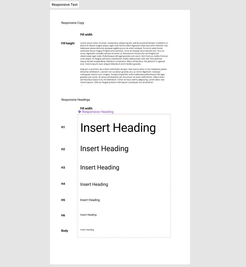
Adding quick text blocks
I had an idea of creating an auto layout block that would be filled with lorem ipsum placeholder text that is used to give an example of where copy would go.
Meaning it would be a component that would automatically scale to show as much or as little text as you wanted.
Caption: Video showcasing text responding to the viewport.
However, for simple headings or titles, it wasn’t the easiest for changing the block to suit that need. For this, we decided to create another text component that would have variables on an auto layout text block, meaning you can change between different heading or text styles and be able to type your own text in.
After conducting our test, we made amendments to the issues that we came across and then continued to build out more components.
Our next steps
Our next steps for this design system library is to develop it further and start looking into patterns and any additional components required across common user journeys, such as;
- Login screens
- Email templates
- Check out screens
- Tile layout templates
- Form layout templates
- Onboarding page layouts
This will enable users of the system to simply drag and drop patterns, not just components, into their prototype.
Another area we want to investigate, is advancing the accessibility and flexibility options within our components. Such as, adding light and dark mode options and allowing them to automatically respond to screens and layouts they are added in. We are also looking into adding modes for responsive sizes for mobile, tablet and desktop. This would allow us to drag and drop components into different screen sizes and they would automatically scale to the correct use case.
Conclusion
We set out to see if it was possible to create a fully responsive and efficient design system library. It turns out, with Figma – you can!
We have created a design system library that will enable not only designers, but also team members and clients to have the ability to take part in the design process. Allowing us to adopt a truly collaborative approach to user experience design both within our team and beyond.