You would be forgiven for assuming that making a restaurant reservation online would be a straightforward, hassle free process. One can search for the restaurant of their choosing, take a glimpse at the menu, maybe even read up about the chef, the sourcing and sustainability of the food and feast upon some impressive images of dishes fresh off the pass. If all lives up to standard, you might even proceed to make a reservation online to test it out for yourself. How difficult could it be? Select your preferred date, the number of people in the party then the time. There can only really be two answers. Yes, I have a table or no, we are fully booked.
The booking process experience is key
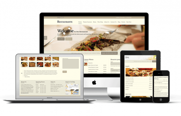
Living in the digital age, a restaurant’s website has become the customers first point of contact with the business and so it is vital that it is user friendly and easy to navigate. The online booking system should be fool proof. You would think that designers of such platforms who offer restaurant reservation services would have carefully constructed their widgets, so they are universally clear to all.
BUT because every restaurant is different it would be unrealistic to expect that one booking system could meet the needs of all. There are many different aspects to be considered when creating an effective booking system.
- floor layouts
- weighting of sections is dependable on the waiting staff available and the business of the restaurant
- you equally do not want to have all customers arriving at once, overloading the kitchen and creating queues coming and leaving the restaurant effecting the ambiance for diners around you.
Basically, every restaurant is different. They all operate in a different fashion and lay greater emphasis on different qualities. Every restaurant adopts a method which works for their own individual needs.
People Vs. Tools
Teamwork is essential to oil the cogs of any business, especially when running a restaurant. But in the digital age, we now have to incorporate technology into our team, and what happens when the technology lets the rest of the team down?
Managing the front desk in a fast passed and vibrant restaurant is by no means a walk in the park. Not only are you the first point of contact for customers entering the restaurant, but you are always the one held accountable for reservation errors. This is how I rapidly realised how vast the problem was.
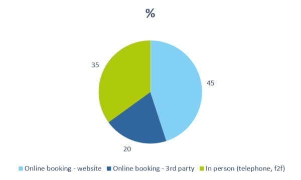
The reason why? Predominantly the online booking system. From my own experience, I can comfortably state, that 65% of bookings for my previous employer were made online via an online booking provider. The 35% left over are made directly, either over the telephone or face-to-face. Roughly around 45% of online booking traffic comes from our own website but the remaining 20% are from 3rd party booking websites which are automatically linked up by the reservation platform used. It should be paramount that a user friendly booking system should be adopted, not only to alleviate life for the customer but naturally it would result in greater business for the company. A difficult booking system which leaves individuals puzzled on how to operate and achieve their simple desired goal of making a reservation, is ultimately deterring business.
A booking system need not to be complicated to the point where it deters customers, but it also needn’t cost an extortionate amount to have a reliable system for both the company and the user. Restaurants have a very tight profit margin. For many business owners so they do not channel the right resources and investment into their digital/online presence. What’s more, they may not be aware of the business potential and do not have time or budget to invest in bespoke systems.
My Experience
As someone who grew up using computers, I am probably far tech savvy than the average diner in the restaurant. If I personally found the booking system to be confusing and full of technical bugs, I questioned how an individual who had grown up without the aid of computers would navigate it.
It is clear that the restaurant, relies heavily on their online booking system as it is where the majority of business stems from but why then is it always the foremost point of downfall… I identified three recurring problems, the source of which could be traced directly back to the booking system. Mere design faults were generating far greater problems further down the line. These faults could easily be tackled, making the whole experience far more user friendly and eliminating future problems.
1. Cross Channel Experience
Firstly, the technology had not been developed to be consistent across channels and devices. It was not designed to work across different browser systems and search engines. This resulted in the widget being unable to fully function on handheld devices, the size of the widget itself changing and crashing half way through the booking process. There were further issues concerning the general design of the content of the widget especially the size and colour of the font and the order of steps you followed when making a reservation. Ultimately the system was full of bugs which occurred when attempting to make the reservation. Leaving many unsure if they had been successful in their attempts to book. I know this, because I was the one taking the telephone calls with individuals complaining about it.
This problem needed to be fixed, so I decided I would just do it myself. I couldn’t help but think that many people were left with the assumption that because the restaurant website was difficult to negotiate and the booking system was too complicated to use, then the restaurant wasn’t worth their time?
The steps I took to resolve this issue were fairly straightforward. I reviewed the stats and could see the amount of traffic from different devices. The top three were iPads, followed by phones then desktop. Funnily enough, the widget works best on a desktop but that was where the least amount of traffic was arriving from! Fixing the widget so it knew to change sizes depending on the device it was being accessed from rose to the top of my list.
2. Look & Feel
Along with adjusting the widget’s size, also came the aesthetic font, colouring and wording of the content itself. This led me to tackling my second problem. So, we have solved the issue of size, everyone can now clearly select the date, but, the next step is selecting an area.
My previous employer had two different sections to dine in. A bar and the restaurant itself. Whilst those who had scoured the website and previous diners would be aware of this, the vast majority of first time customers are not. This led me to introduce not only descriptions of the different areas in the selection process but also a photograph, so that the user could see visually the area they would be dining in.
As it apopular restaurant, we would always be fully booked at the weekend for months in advance. Many are of course not aware of this. The problem was that if we were fully booked in the restaurant, the option to dine in the restaurant would simply not appear and only one option – to dine at the Bar would be available for those wishing to make a reservation online. There was nothing on the website to explain that we were fully booked.
I found this to be a big problem as guests would arrive believing they had made a reservation in the restaurant when actually they had made a reservation to sit at the bar. Again, this was a recurring problem and one which frustrated me. I thought it was a problem which really shouldn’t exist and because it did happen on such a regular basis, shouldn’t it just be solved? This led to a discussion with a widget designer on how our own widget should appear and the process by which I would like our customers to experience the website
3. Digital Effecting Real World Experience
This then led to the final problem – how to deal with the angry complaining customer. If it is a Saturday night, you are fully booked, and have 2 angry customers, creating a scene, demanding to be sat in the restaurant instead of at the bar because they have flown all the way from Sydney, specifically to sample the lobster. Do you then cave and offer them a table that is reserved for another couple who are due to arrive in fifteen minutes, forcing you to then push their booking back resulting in a complete re-organisation of bookings for the evening?
Or do you softly explain that unfortunately, mistakes do happen, there is no room in the restaurant, the best we can do is offer you the seat at the bar that you booked, we can get you a glass of champagne and we are very sorry for the confusion caused. OR do you just ask them to leave following the scene they have made based on their unwillingness to compromise and meet you halfway? It is difficult to arrive at the right decision and of course the right option varies on the customer and their behaviour as well. BUT – this whole charade could be avoided altogether, if the initial design and user experience had been tested before it was put into action.
A failure, no matter in what area it is always the businesses problem, if something is not running as slickly as it should be and creating customer dissatisfaction it is directly accountable to the business.
Don’t Forget Other Touch Points
But, managing and updating our own booking system was only the first step. I had to ensure that all third party websites who had direct access to our booking system were informed and also made the applicable updates to their own websites and bookings so that similar scenes would not be repeated via bookings from their own mediums. This was both time consuming and at points frustrating trying to explain to web designers the problems I was trying to address and what I needed them to do in order to remedy it.
Advice for Future
Despite the time, hard work and money gone into software design and developing technologies, we cannot rely on it 100%. There is always the opportunity for mistakes to be made both technologically and manually. Keeping that in mind, more accessible platforms for restaurant reservations need to be developed to alleviate problems faced by busy businesses.
What can be done to solve this problem?
My answer: A universal application restauranteurs?!? Which can be used not only to make reservations; but can meet the individual needs of the restaurant. This may have to be achieved through an initial consultation with a programmer (additional cost) so it can pace the reservations throughout the evening and reorganise table setting s automatically. It must also send notifications to the user and customer when reservations have been made and any additional comments such as dietary requirements or celebrations.
Further, similar to TripAdvisor, reviews can be made and information be found, as well as a sample menu. If a restaurant is full, suggestions to restaurants of a similar standard close by with tables available will be offered as an alternative.
But perhaps such a feat is unrealistic. A growing platform similar to this does exist – Open Table, who has recently expanded across to the UK. But their user satisfaction is questionable.
My top three tips to take away
- Websites are now how most people initially view differing businesses and it is thus vital that businesses operate online effectively.
- Initial design and user experience greatly impacts the business in all respects later down the line.
- If it is user friendly, you are more likely to generate business as if it is easy to use, it is more accessible.
Want to know if your booking system is fit for purpose?
Get in touch with us today and we can review or audit your process.