Responsive and Adaptive design are two common approaches for website development. Both allow websites to be experienced on different sized devices. But when undertaking a project, it’s important to be aware of the key differences. So, you can select the best approach for your users.
So, what is the difference and which should you choose?
Responsive Design
Responsive designs make websites viewable in response to the size of device being used. The placement of design elements naturally adjusts to the space available. A key reason for its popularity being that the approach bases itself on a single design template. In turn, eliminating the need for different development for every device on the market.
Responsive web design frequently links to a strong user experience. The single design is uniform and seamless across devices with only slight differences on mobile. What’s more, the volume of available frameworks (e.g. Twitter Bootstrap) makes this an attractive option, given the amount of time these can save.
Mobile page loading times reflect one of the main concerns associated with responsive designs. A responsive page loads the information for all devices, not just the one being used. On mobile this could lead to perception issues whilst waiting for content to appear. Furthermore, as responsive designs hide and display elements some content can be harder to find. In extreme cases, links or buttons disappear totally meaning content can’t be reached.
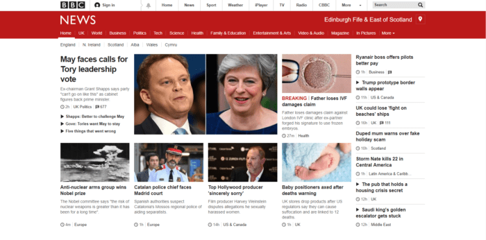
BBC News adopts a Responsive approach to their website:

Adaptive Design
Rather than using one design for all devices, adaptive design approaches create many design templates. These custom designs optimise to every device, screen size, and potentially operating system. Breakpoints (e.g. 320px for mobile, 760px for tablet, and 1024px for desktop) define static layouts. Unlike responsive designs, adaptive ones do not change once they load into the browser. The device in use is detected first which then calls the correct layout to view.
Custom designs ensure that the right content appears in front of the right users. For example, a smartwatch user requires different information to that of a desktop user viewing the same page. By optimising designs for every device, users get the most from their experience. An example of this may be adding fewer images or simplifying navigation on mobile.
The main drawback of the adaptive design approach is the number of resources required to create a series of designs. Creating designs across several of devices incur lengthy timelines and costs. With more designs, the risk of content appearing dissimilar across devices increases.
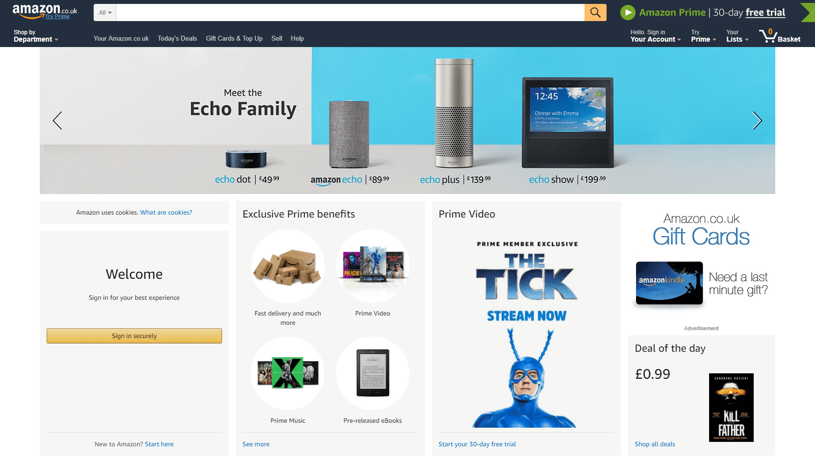
Amazon adopts an adaptive design approach to their website:

Choosing the Right Approach
There are pros and cons for each approach. The impact of these should be assessed in terms of business needs. If generating inbound leads is a key objective. Then the influence of approach on SEO should be a key factor.
For example a responsive approach is Google’s recommended design pattern because:
- One URL, One Site: The same HTML code, content, and URL remain the same regardless of the user’s device. This focuses links and SEO on one domain.
- Bounce Rate: Recognisable content across devices makes users feel more comfortable = Good UX!
Adaptive Designs have their advantages, but SEO is not one:
- Many URL’s, Many Sites: Varying HTML code, content, and URL’s don’t sit right with Google. Having identical articles and duplicate content on different versions of your website confuses its ranking system.
- Bounce Rate: Content appearing too dissimilar across devices confuses users = Bad UX!
Opting for one design approach over another requires careful consideration. It’s crucial to weigh up all the pros and cons in relation to your project. Responsive approaches reduce workload and perhaps appeal to clients with smaller budgets. While Adaptive ones benefit websites that target different user types across devices. Ultimately the choice you make should reflect the constraints of your project.
Liqui-dap-sive is a great website that shows you how a website will look if they have been designed with responsive, adaptive, liquid and static approaches.
If you’d like to discuss whether a responsive or adaptive website is best for you, contact us today!